Balance built into one platform
-
Website Design + Development
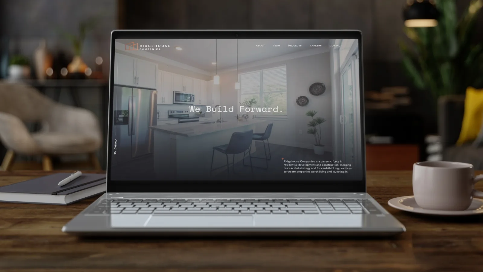
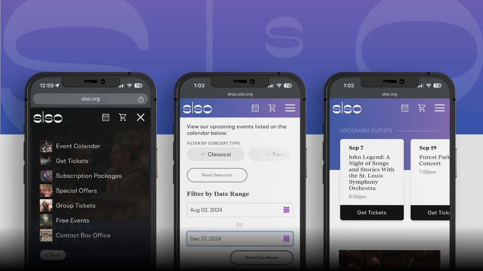
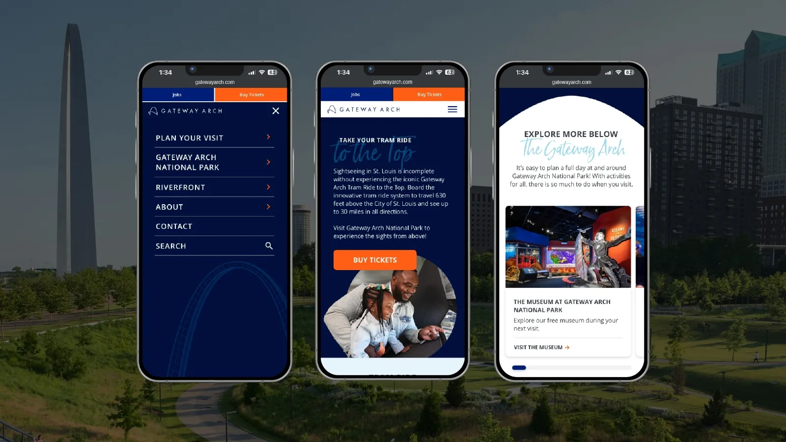
Where design and performance work as one. We create custom websites that blend brand storytelling, seamless user experience and reliable development — turning your platform into a fast, functional and memorable digital home.
-
Software Development
Build exactly what your business needs with custom software that streamlines operations and enhances user experiences.
-
Website Audits
See what’s working — and what’s holding you back. We evaluate your website’s performance, usability, search visibility and technical health, turning hidden issues into clear opportunities for smarter growth.
Building forward
Orchestrating wonder online
Crafting a world-class website
What is the process for building a custom website?
The process for our custom website development services can be boiled down to six stages.
- Discovery. We begin with a collaborative discovery process. Our website team meets with your key stakeholders to explore current platform performance, new ideas and business goals.
- Market Research. Next, we survey the landscape for industry trends and consumer insights. Our strategists compile the findings into a strategy that defines your most competitive approach to the web.
- Content Creation. From there, our creative team takes the reins. Our copywriters deliver user-centric storytelling while our designers build a standout visual identity for your brand.
- Development. Creative concepts are passed to our web and tech team. They bring our creative team’s vision to life through lines of code and ensure every element functions as intended.
- Review. At each stage, you’ll have an opportunity to review our progress and provide feedback. Your responses will guide adjustments within each department.
- Launch. Once you give the green light, your website will go live. Our website team will provide ongoing support shortly after launch to ensure the final website exceeds expectations.
What type of websites does Paradigm create?
Over the past 30 years, our custom website development services have touched nearly every industry and application. Our website work ranges from small business sites and landing pages to full-scale corporate websites and e-commerce platforms.
What services do you offer for websites?
Paradigm is a full-service website design company in St. Louis. As such, we provide end-to-end website services, including:
- SEO strategy
- Copywriting
- Design + development
- Software development
- Analytics
What’s the difference between websites and web apps?
Great question — this is a common source of confusion.
On one hand, websites are primarily for providing information about your products, services and brand. On the other hand, web apps are used to perform tasks, such as logging in, shopping or managing user data.
Basically, web apps require advanced technology, such as databases and back-end systems, to handle complex interactions. Luckily, our custom website development services can tackle both.
Why should I hire a web developer?
Paradigm has over 30 years of experience in website development. That equates to endless hours of experience in coding languages, user experience, search engine visibility, mobile responsiveness and more.
When you hire a web developer from Paradigm, you save the time and energy it takes to learn best practices and gain a truly custom platform for your brand.


