Bethesda Health Group
Exceptional senior living, care and services
Bethesda Health Group is the St. Louis region’s leading provider of senior care. Its offerings range from in-home care to live-in communities — but without digital marketing for healthcare, audiences had yet to grasp the brand’s breadth.
Supporting communities close to your heart and home
CHALLENGE
Years ago, Bethesda noticed a fundamental shift in how its audience searches for senior care. Seniors and their families were starting and finishing their research online, but Bethesda’s web presence hadn’t caught up. The brand needed an agency well-versed in senior living marketing to appeal to online audiences of all ages.
SOLUTION
Paradigm has partnered with Bethesda Health Group on several projects over the years. Through senior living website design and associated marketing activations, we’ve built a digital ecosystem that showcases what makes Bethesda the best name in senior care.
Web Design
An important piece of senior living marketing is knowing the audience.
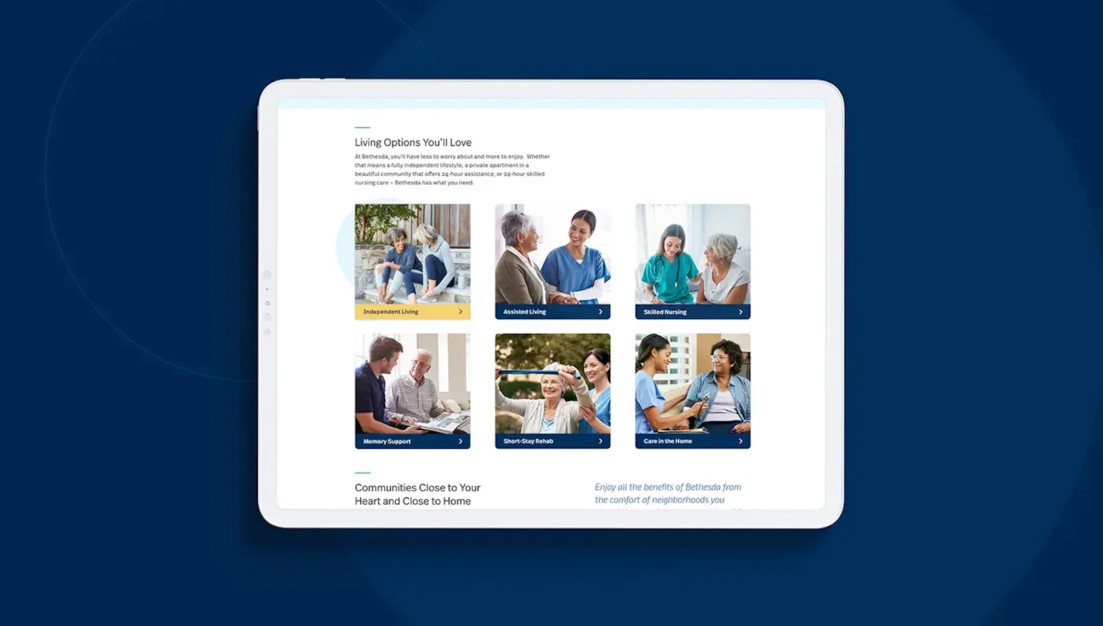
Bethesda’s audience faces an often stressful life transition as seniors seek additional support. As such, we felt that Bethesda’s new website needed to reflect its capacity for care and attention — especially when it comes to the little things.
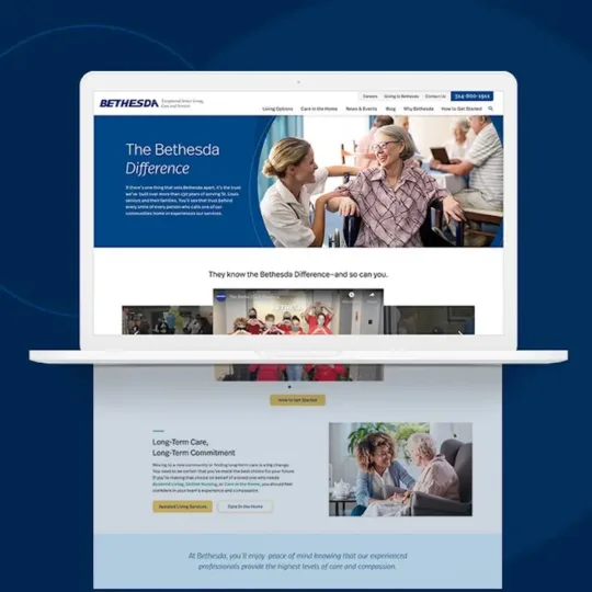
First, we turned our eyes to usability. Our designers reworked the navigation, emphasizing quick journeys that reveal critical information in as few clicks as possible. We then optimized load times for each page, ensuring that families could access pages in hospitals with spotty cell service.
Next, we referenced brand precedent. Bethesda’s senior living marketing frames community as a way of life that makes each day feel fun, vibrant and comforting. Naturally, our designers preserved this perspective by leveraging community as a design element. Custom photography of residents, families and caretakers dominated each page — revealing that personal connections truly define Bethesda’s brand.
Finally, we made it easy for users to take the next step. Our senior living website design incorporated eye-catching calls to action and anchored contact forms on each page. These accessibility features ensured that, no matter where a user lands, they can click, call or submit without an additional search.
Content Strategy
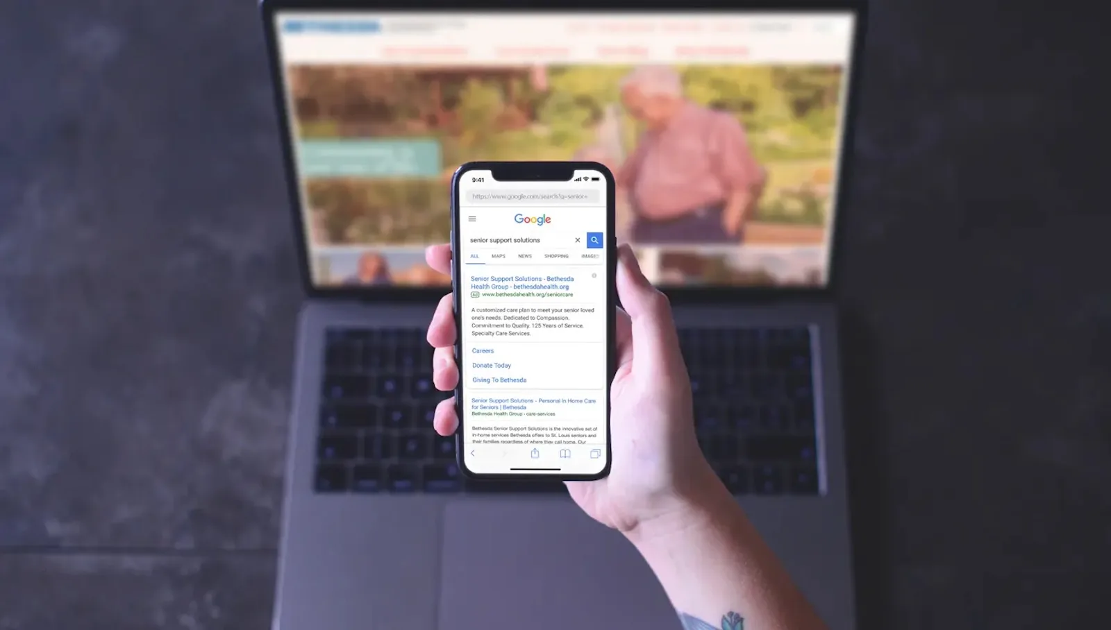
Since launching Bethesda’s website, we’ve worked with the leadership team to keep the brand on top of search.
Each month, our team researches and compiles blog topics with high-value keywords. This editorial calendar highlights opportunities to revitalize old content or write new content that captures additional keywords. Additionally, we provide Google Analytics services that keep the Bethesda team aware of its performance in senior living marketing over time.
-
24%
growth in site traffic year-over-year, with a vast improvement in SERP visibility
-
286
keywords in the 1-3 organic positions on Google SERP
Digital Marketing
Ahead of opening its newest community, Hawthorne Place, Bethesda enlisted Paradigm to spread the word.
We developed an inbound strategy of paid search and digital banner ads targeting families searching for senior care online. Those ads drove users to a lead-generating landing page, where they could submit a form requesting information from a Bethesda representative.
Thanks in part to our abilities within digital marketing for healthcare, Hawthorne Place achieved full capacity just a few months after opening.
Careers Website
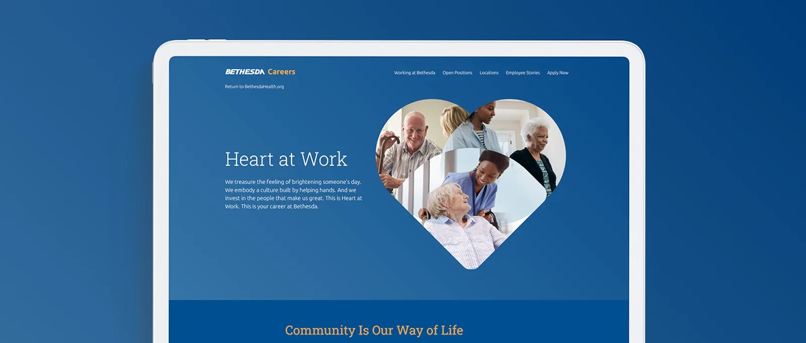
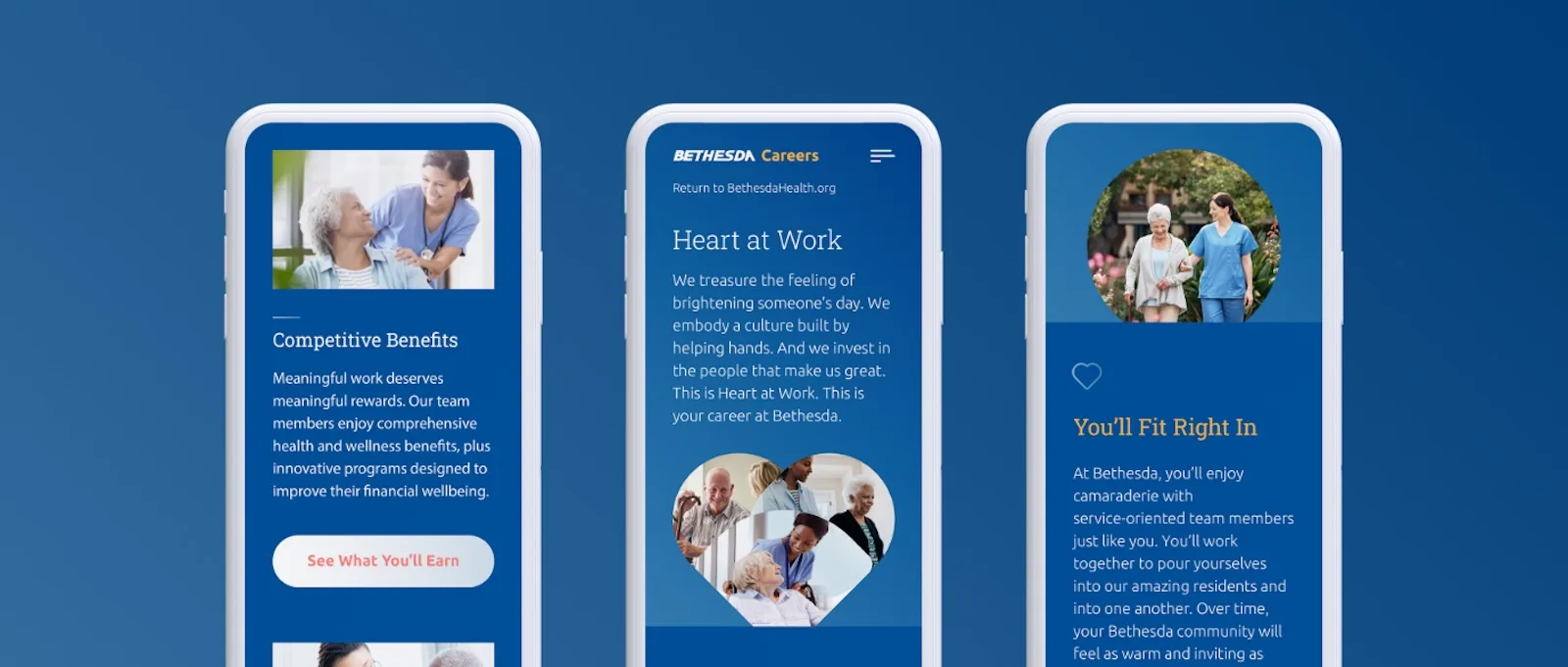
Following the successful launch of its primary website, Bethesda sought to develop a microsite targeting ambitious career seekers.
We responded with a platform that pulls at the heartstrings of professionals who are committed to care.
The content adopted the warm, compassionate tone established by Bethesda’s parent brand. At the same time, it specifically targeted professionals through team-centric language that illustrates the intangible value of working in a Bethesda community.
The senior living website design took visual cues from Bethesda’s primary platform, remaining lightweight, simple and focused on one-to-one relationships. Yet, there was one strategic deviation: a signature heart icon featured prominently to emphasize the value Bethesda places on compassion.
“When you’re looking for a marketing agency, you want somebody who’s going to bounce ideas off of you. [Paradigm] is going to listen to all of yours. I’m never afraid to ask: What does this mean? What is this? Or is this something we should be keeping our eyes on? You need a vendor who’s going to work with you, not just for you. It’s just been a very positive relationship.”
Jeff Waldman and Madison Lanford Corporate Vice President / Director of Marketing and Digital Marketing Manager
