NPS Wellness Challenge
The National Park Service
The National Park Service has inspired lasting moments of personal wellness and opportunities for adventure in its parks for over 100 years. The parks offer visitors space to advance their physical, mental and emotional health through immersive historical experiences and stunning views.
Your gateway to wellness starts here.
CHALLENGE
The National Park Service and Gateway Arch National Park sought Paradigm’s in developing a program to promote physical and mental wellness across Missouri’s seven National Parks.
SOLUTION
Their NPS team came to us to brand the NPS wellness challenge, establishing each park’s wellness challenges, a consistent brand voice and strategic print and digital pieces to reach a vast target audience.
Brand Positioning
The Paradigm team developed the branding for the National Park Service Wellness Challenges for all seven Missouri National Parks.
Through our discovery sessions, we uncovered a common goal for the challenge — to inspire lasting moments of personal wellness within Missouri’s National Parks. The National Park System encourages every person to set aside time to get up, get out and explore with each challenge a visitor embarks on.
We framed the NPS Wellness Challenge as an explorer who finds fulfillment in discoveries and new experiences – creating a better, more authentic life for themselves. From the brand’s personality and story, we developed a signature promise for every person in any park — personal wellness is Well Within Reach.
Brand Identity
We approached the NPS Wellness Challenge’s logo design from multiple perspectives to unite the human experience in nature inside one graphic element.
The challenge features physical, mental and wellness challenges signified by the logo’s bold colors: orange, green and blue. Its element of visualization allows one to embrace the depth of personal wellness they will encounter in each park’s challenge.
From the initial logo, we pulled from each color to create specialized badge logos for the physical, mental and learning challenges. The physical challenge’s use of a vibrant orange stimulates movement and progress found in each physical activity.
The verdant green offers a sense of tranquility found in each park’s mental challenges.
The deep blue highlights both a richness and curiosity present in every learning challenge as visitors uncover newfound knowledge of American history.
Content Strategy
The NPS Wellness Challenge in Missouri required robust content efforts, both digitally and in print, to deliver its message.
We developed content for multiple website pages hosted within the National Park Service’s website to describe the wellness challenge, the unique challenges at each park and how visitors of all abilities have an opportunity to obtain their badges of completion.
Our team met with members of the Healthy Parks, Healthy People division of the National Parks Service, Missouri National Park rangers and additional park representatives to gain a deeper understanding of the unique features of each park. While each park is different in its own right, all offer the same goal to all visitors — a place where everyone can embrace personal wellness.
This united vision for the NPS Wellness Challenge formed four pillars: personal wellness, wide reach, diverse experiences and individual focus. We drew from each park’s immersive experiences, rich cultural and natural significance and inspiring views to create the complete story of the lasting impact the challenges would have for each park and each person who visits it.
Print Design
The NPS Wellness Challenge needed multiple visual assets to showcase each park’s challenge as well as its main message — Well Within Reach.
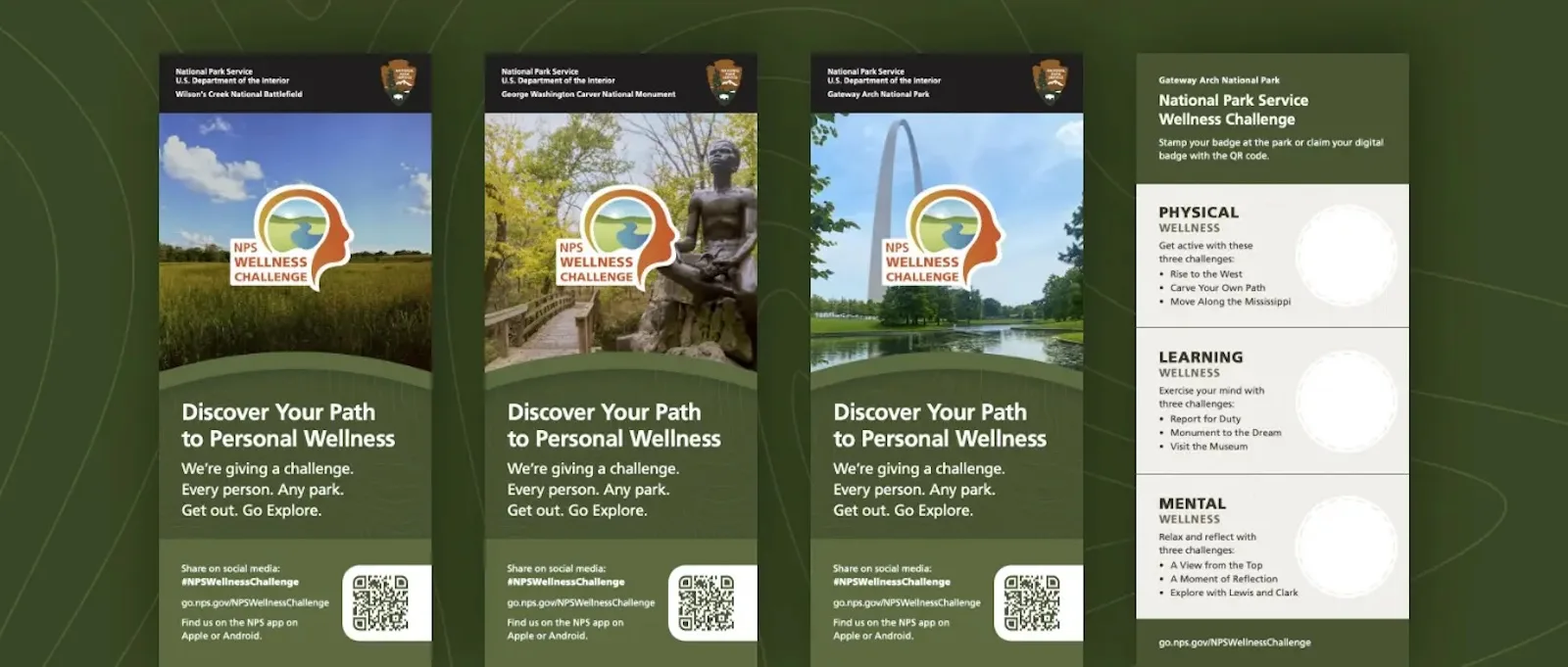
We developed physical stamps, digital challenge badges, rack cards, QR code window clings and vibrant digital imagery to resonate with all people.
Pulling inspiration from natural elements, the color palette of orange, green and blue encourages people to take action, learn something new and relax in the presence of nature. Our designer added graphic elements inspired by topographic maps to add additional personalization to marketing materials.
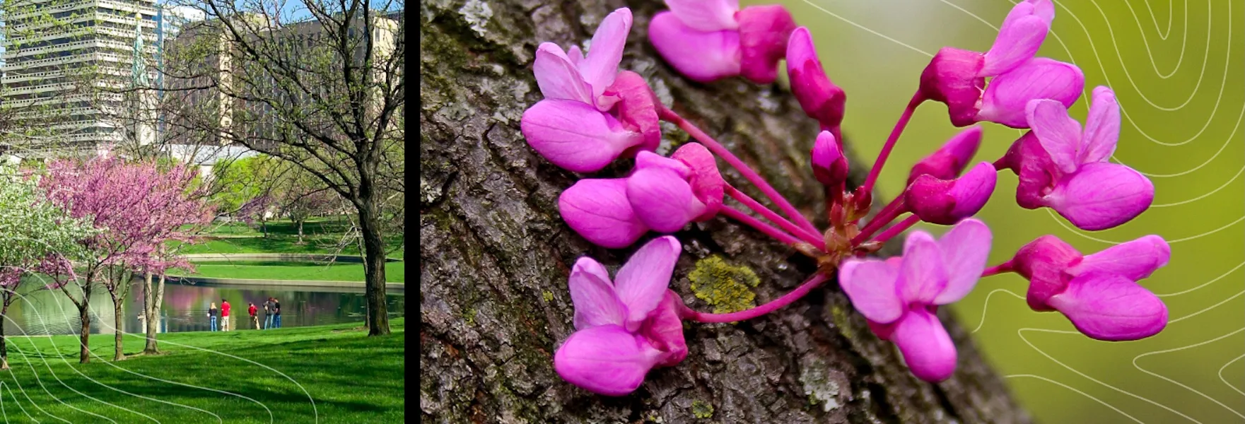
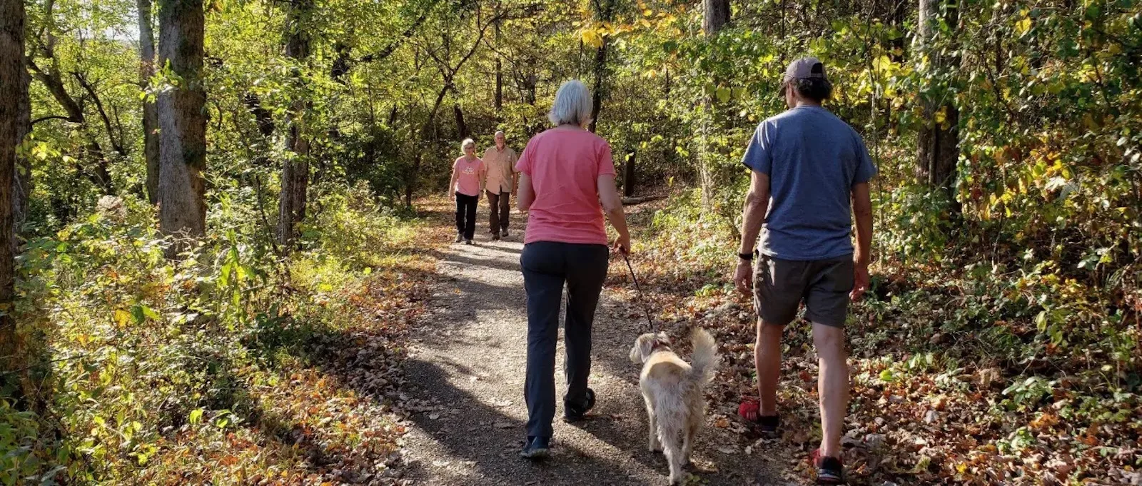
Additionally, the challenge places a large emphasis on photography, featuring real-world environments, people participating in outdoor activities and a sense of brightness to help capture the beauty of Missouri’s National Parks.
Video and Scripting
We created 10 short-form videos and two radio scripts to describe the wellness challenge and each of its challenges.
The 10 videos highlight each unique challenge in order to draw new visitors to the park to participate in the challenges. Each video is used by the park for social media, web and on-site efforts to generate more participation in the Gateway Arch National Park’s specific challenges.
Our radio scripts were aired on local radio stations and as an announcement at Cardinals baseball games during the 2022 season.
Our work with the National Park Service and Gateway Arch National Park brought a wellness challenge to visitors, encouraging people to reconnect with what makes them feel whole by supporting their physical, mental and emotional well-being — all within reach at Missouri’s national parks.
