Insights come to life
Data doesn’t become powerful until it’s understood. Paradigm’s data visualization services give your insights shape, color and impact so they connect with audiences instantly.
-
Define goals
As your data visualization agency, we uncover the story you want your data to tell. Through conversations between our team and your stakeholders, we ensure the final design is rooted in clarity and aligned with your desired outcomes.
-
Assess data
Our team dives into the numbers — evaluating the quality, structure and depth of your dataset. From there, we organize the information and uncover patterns that form the foundation of a compelling design.
-
Devise concepts
With your vision top-of-mind, we explore presenting data visually. Our designers experiment with color, format and interactive elements, yielding a data visualization design that balances both beauty and function.
-
Deliver visuals
Polished concepts turn into powerful tools. By the end of our data visualization services, we implement intuitive and actionable visuals — and remain on standby for ongoing updates and performance monitoring.
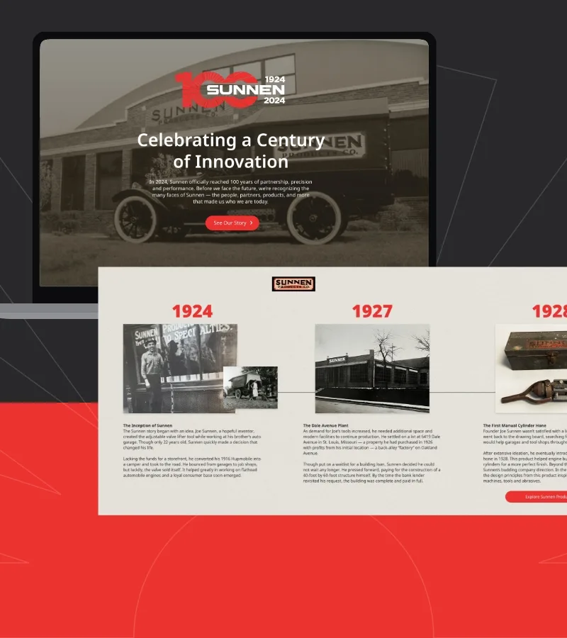
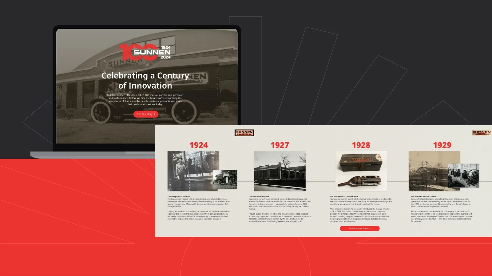
Anniversary landing page
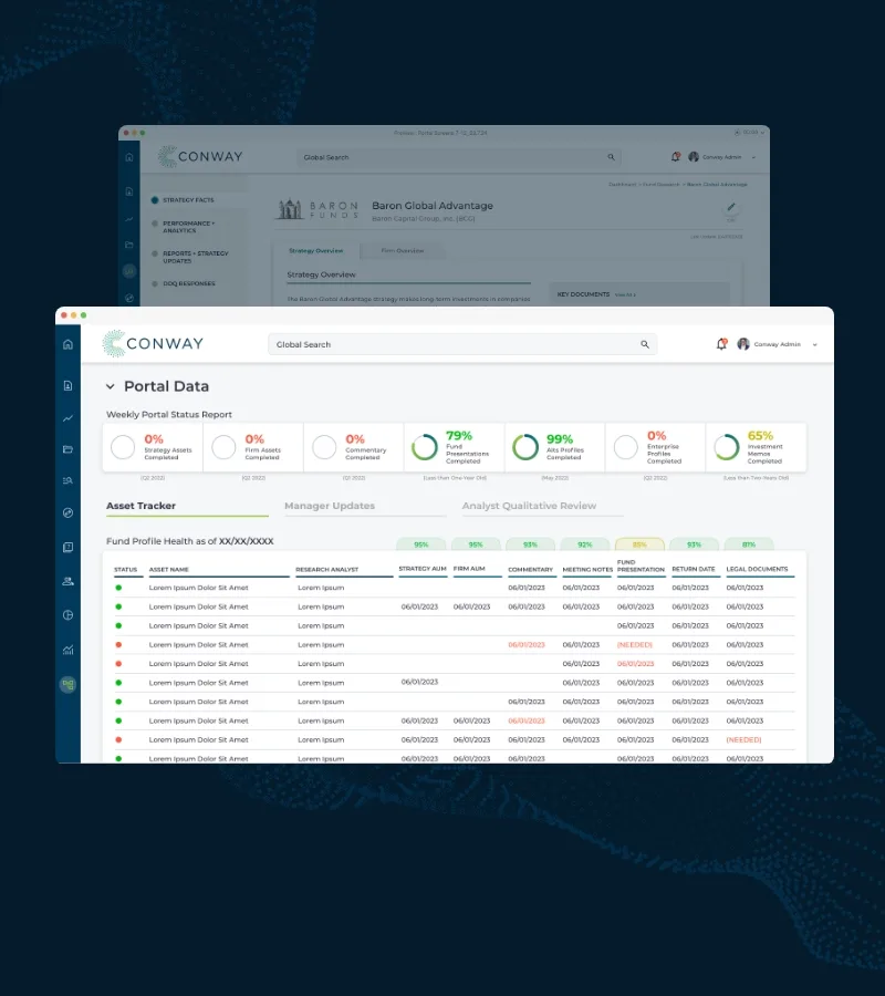
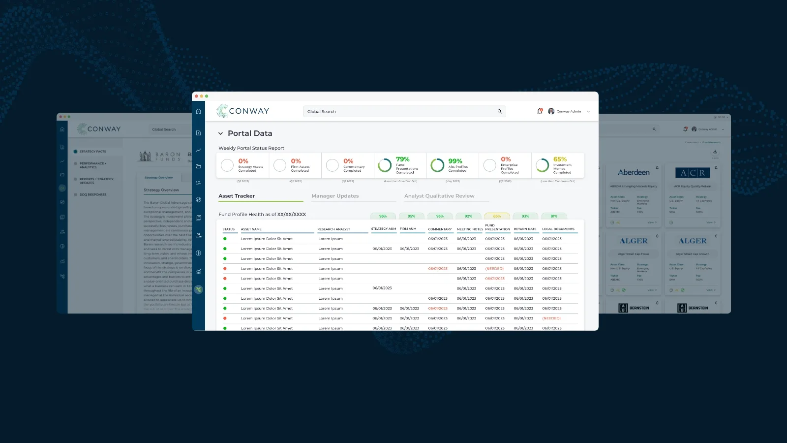
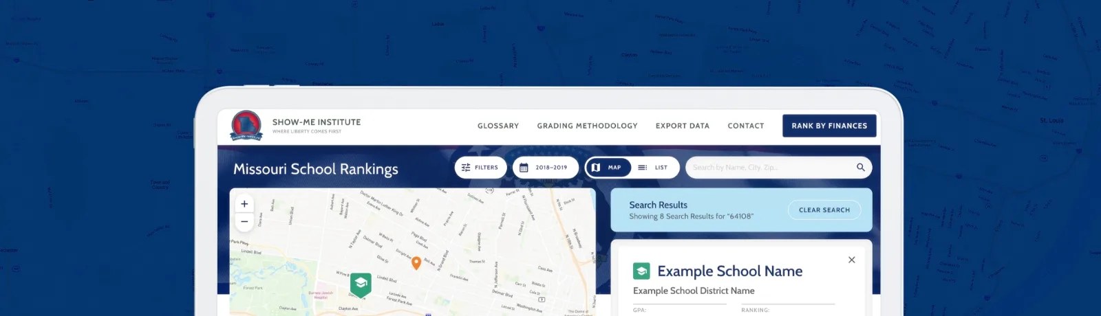
Investment research portal


Annual impact report
Complexity, meet clarity
Data can be messy, overwhelming and full of hard-to-see patterns. Every chart, graph, map or dashboard is designed to illuminate the story behind each dataset through:
Simplicity
Keep it clean. Our data visualization agency team uses visual elements, like color, font size and annotations, to highlight key insights.
Interactivity
Foster a sense of discovery. Our team creates data visualizations with interactive features, such as sliders, pop-ups and filters — empowering active exploration.
Impact
Stick with users after the session ends. Each data visualization design leaves a mark — turning insight into action and instilling confidence in consumer decisions.
What formats does Paradigm use?
Our data visualization services cover any format your project requires. We’ve created simple visualizations such as pie charts, bar graphs and scatter plots — but we aim for more dynamic formats whenever possible.
Some ideas for data visualization design include:
- Heatmaps. Heatmaps show intensity or density of data using color gradients. For example, this format could showcase sales concentration for your organization.
- Interactive Dashboards. Dashboards bring multiple charts and KPIs into a singular view. For example, this format may showcase progress in your daily operations.
- Animated Charts. Animation transforms a traditional data visualization format into a dynamic storytelling platform via axis, movement, time sliders or racing graphs.
- Timelines. If your data has a chronological component, timelines allow you to show information in a sequential order.
How do you decide which format is right?
The direction a data visualization agency takes depends on the:
- Category. Data may be categorical, numerical or continuous — and each type has an optimal way to display it.
- Volume. Larger datasets may require aggregation or additional features, such as filters.
- Goal. We consider the question your audience has and how your data display can answer it via comparison, distribution, relationship, composition or trends.
- Audience. We think critically about your audience’s level of expertise and tailor our data visualization design to fit their capabilities.
Do data visualization services support updates?
Yes. As part of our data visualization services, our developers can establish visuals that refresh with updated data. This ensures that you continue presenting data visually without repetitive work.