Industrial Battery Products
Your partner in power
Industrial Battery Products (IBP) is the Midwest’s leading provider of professional-grade batteries for lift trucks. The brand planned to expand its offerings — but not without industrial branding and b2b website development.

Powering new possibilities
CHALLENGE
IBP began in 1977 and eventually grew to six locations serving the Midwest region. For much of its history, the company had succeeded through a winning combination of exclusive products and exceptional service.
But as IBP broadened its offerings to include EV charging stations and power backup systems, it needed an identity that told the whole story of its capabilities.
SOLUTION
As an industrial branding agency, Paradigm reimagined IBP’s identity —positioning it as a trusted partner for all things power. But our work didn’t stop there. We brought IBP’s identity to new audiences through marketing collateral and b2b website development.
When taken together, our work set the tone for the next stage of IBP’s expansion.
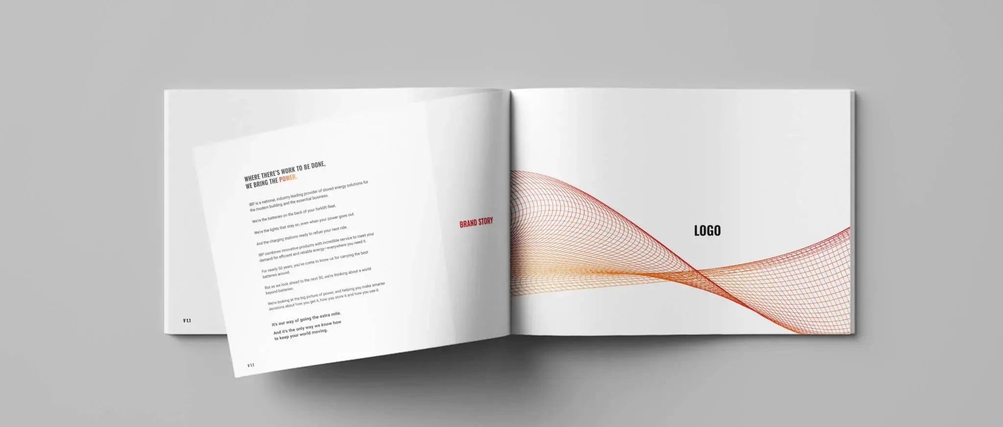
Brand Positioning
We spun a story that addressed IBP’s offerings, audience and aspirations.
Discovery sessions revealed that IBP was pursuing a world beyond the batteries that had made it so successful. Our charge was to equip IBP with a bigger, broader message that it could go to market with — without alienating its core battery customers.
We responded with a brand positioning document that outlined IBP’s new messaging approach. Elements included a refined mission statement, new core principles and brand pillars that clarified IBP’s core strengths. Together, they communicated a brand centered on power and partnership.
Our industrial branding agency positioned IBP as a partner you could trust to do three things: keep you charged, keep you ready and keep you happy.
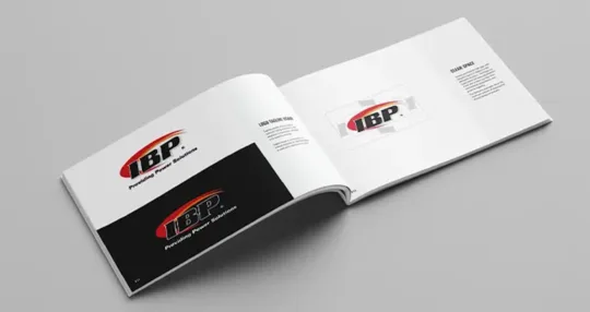
Logo Identity
We designed a series of logos to support IBP’s key initiatives, like PowerCare and EV Charging.
Similar colors, gradients, fonts and icons were implemented to create a sense of continuity. Ultimately, our system allowed consumers to make a positive association between the parent brand and its subsets — building confidence in both existing and emerging service offerings.

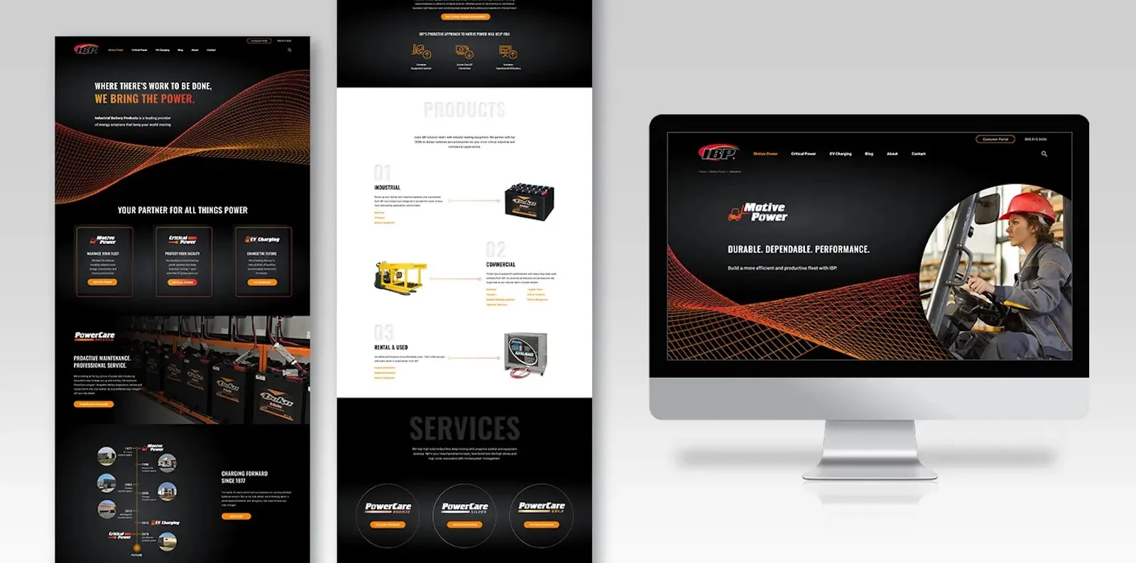
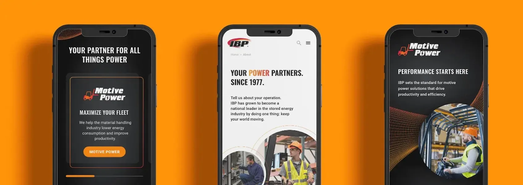
WEBSITE DESIGN
IBP’s products are centered around power, energy and charging solutions that keep your world moving.
During b2b website development, we kept the concept of energy in mind.
Images, graphics and text incorporate motion into the page. Photos and text groups slide in from the sides of the page, the timeline builds from a central line and the location map pings as you roll over it. Yet, one feature steals the show: a flexible grid plan assembles in the background to create a sense of perpetual motion.
Colors were selected carefully to create contrast. Stark whites and bright oranges pop out against a deep black background — propelling users forward while instilling a sense of power.
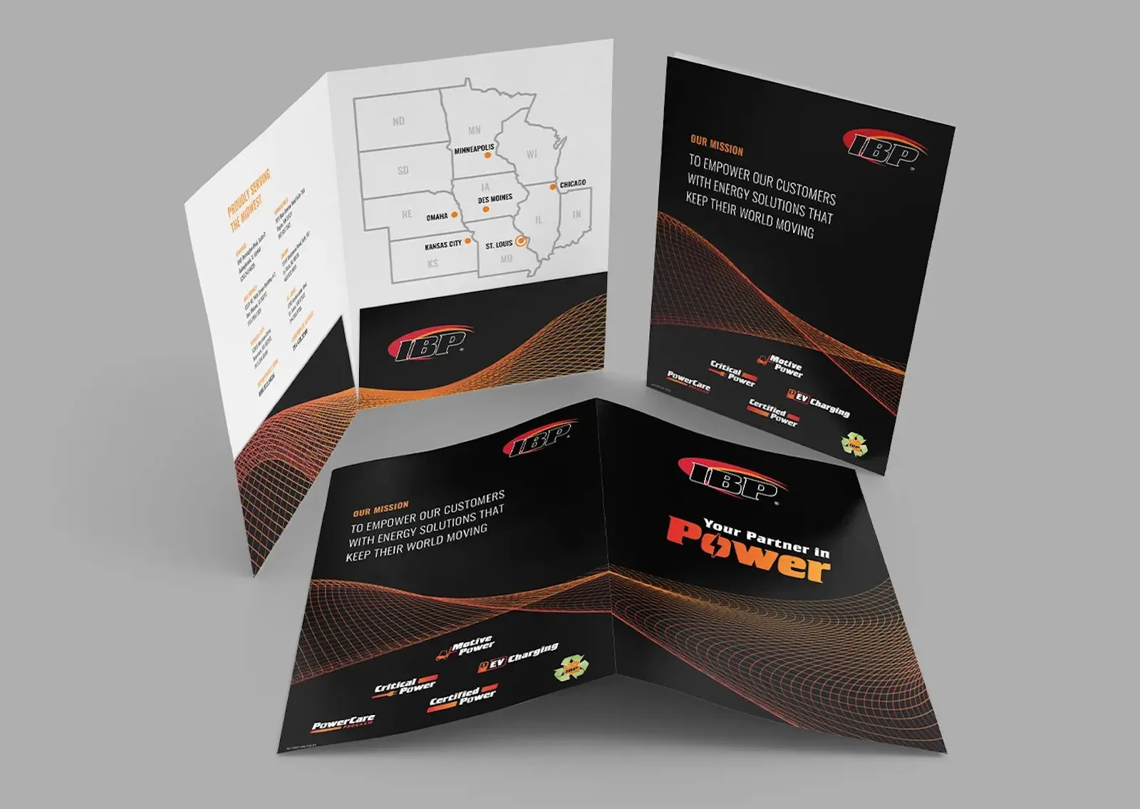
Collateral Writing + Design
IBP’s sales process relied on printed collateral, much of which had not been updated in years.
These pieces were intended as introductions but were executed in exhaustive detail, featuring an overwhelming amount of product and process information. We wanted to condense IBP’s brand collateral into attention-grabbing assets that direct customers to a real sales representative.
Our industrial branding agency rewrote several pieces to reflect the distinct tone and value propositions outlined in our positioning document. Then, we redesigned them with a focus on readability and hierarchy. We even designed a folder to house multiple pieces for distribution at trade shows and events.
By the end, IBP’s collateral did more with less — piquing interest in a strong, confident brand.