St. Louis Shakespeare Festival
A magical 2026 season
The St. Louis Shakespeare Festival is a centerpiece of summer in St. Louis. The festival transforms Forest Park into a community stage highlighting history’s most memorable stories. However, each new production carries its own magic — sparking a need for event branding services.
Balancing unity and individuality
CHALLENGE
The St. Louis Shakespeare Festival brings novelty to the stage — whether it be a new take on a beloved classic or a rendition of lesser-known works. But constant change creates a balancing act between brand consistency and the spirit of each production.
SOLUTION
As an event marketing company, Paradigm crafted visual assets to give the 2026 season a modern edge. To meet the request, our designers crafted a custom production artwork that traded traditional motifs for art that feels truly alive.
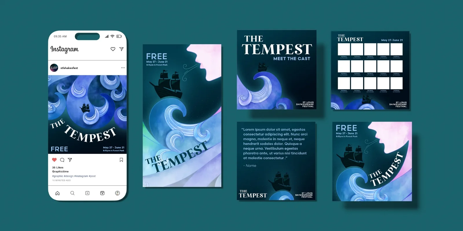
Elements from each piece were crafted to carry across platforms — making seasonal promotions feel cohesive for audiences and intuitive for internal teams.
Strategy
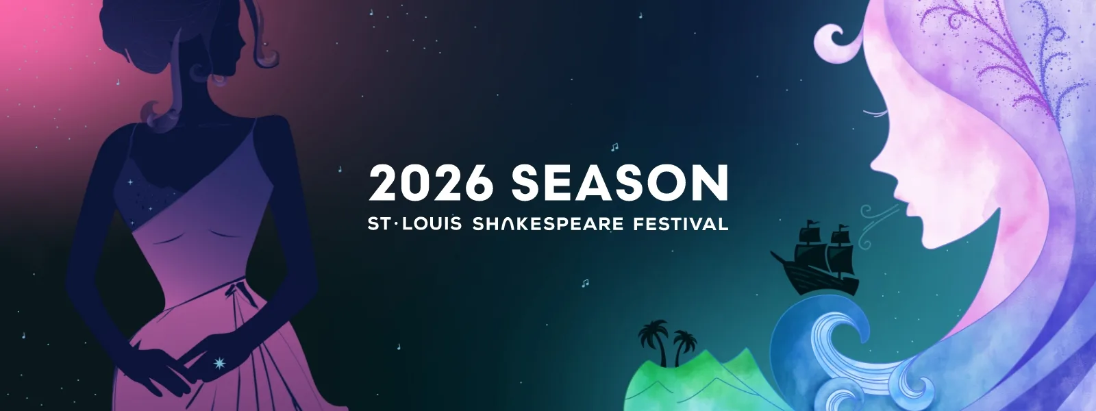
The St. Louis Shakespeare Festival aimed to unite its productions under a singular theme.
The Tempest, Two Gentlemen of Verona and Romeo & Zooliet are wholly unique productions — but all are bound by themes of renewal. As such, our team proposed creating a thematic identity system for the season, with assets that would translate across print, digital and environmental channels.
The final strategy included multi-stage event branding services, including posters, digital assets, logos and brand guidelines for the 2026 season.
Print Media
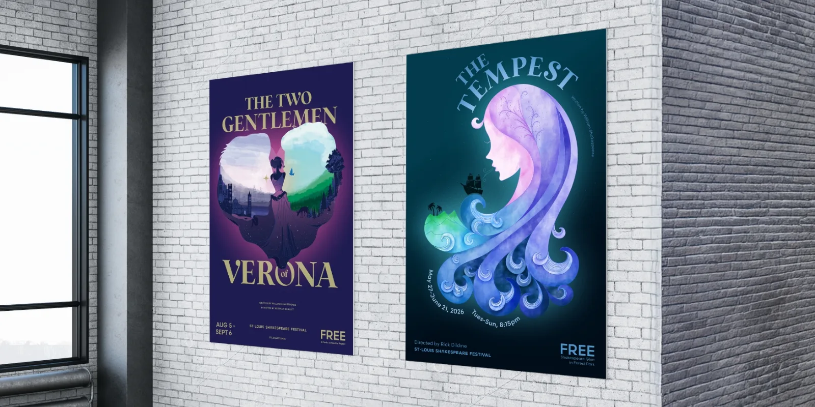
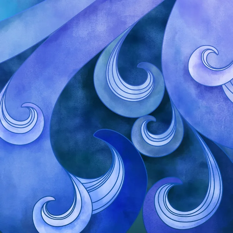
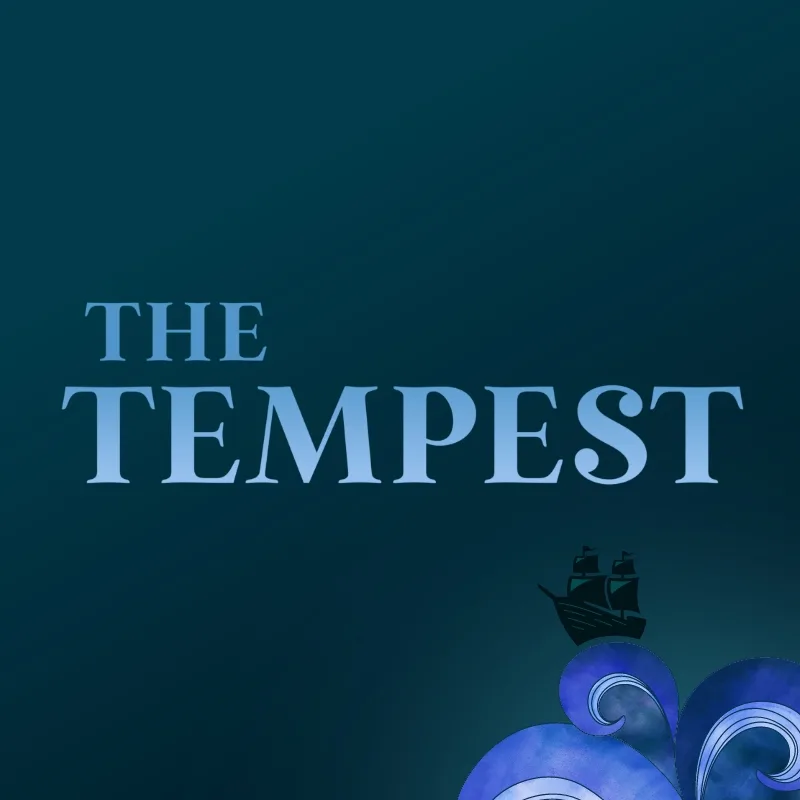
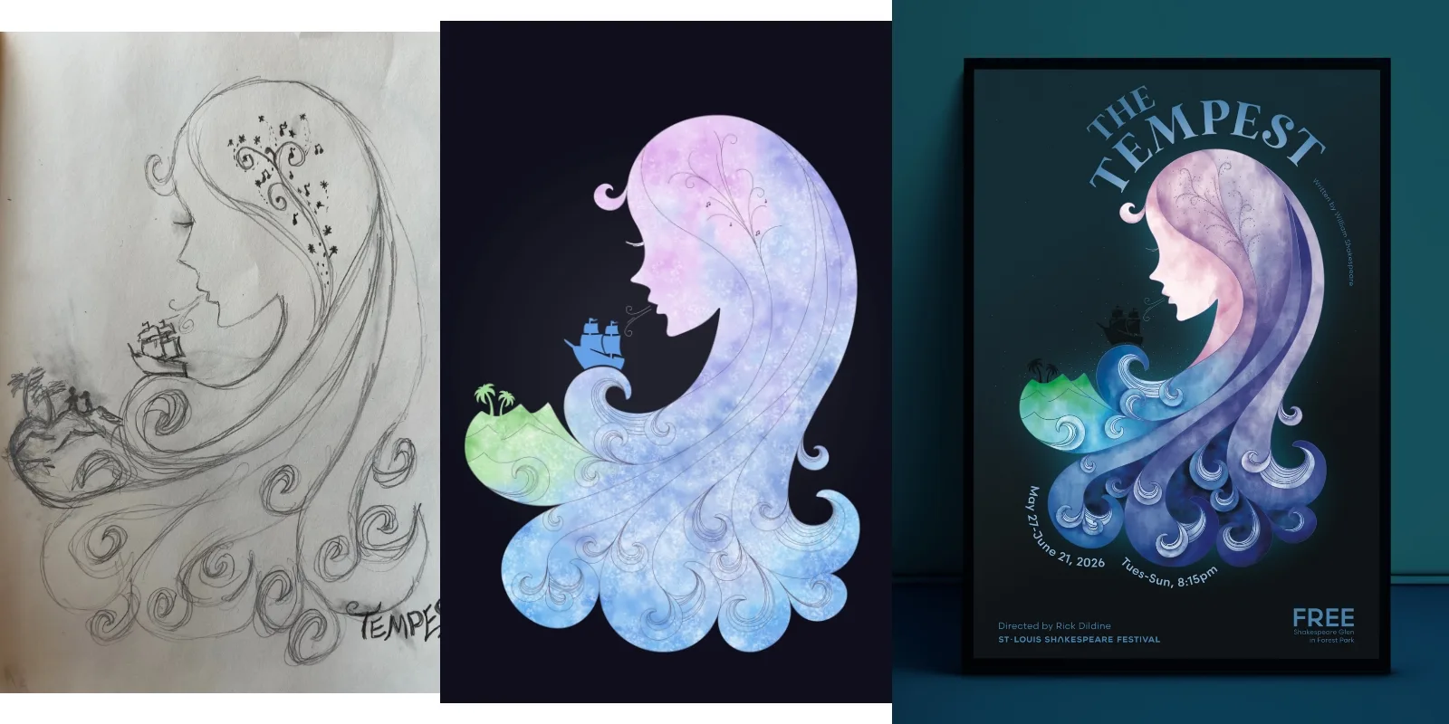
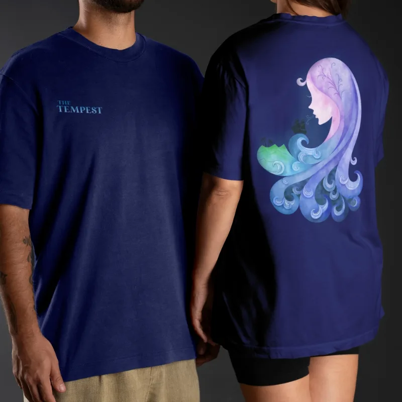
Our design for The Tempest erred on the side of subtlety — hinting at a storm to come.
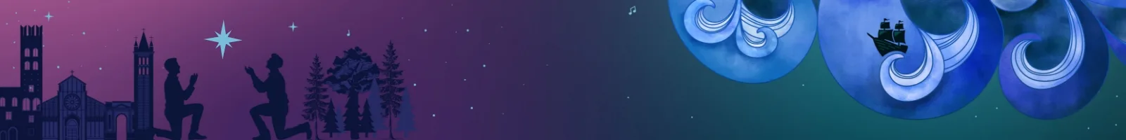
Ariel, a central character of the play, emerged as the focal point of our design. Her silhouette is speckled with icons that allude to the plot, such as a ship and an island. Movement from her figure defines the design — with a ship following her breath, magic brewing at her crown and waves billowing at the ends of her hair.
To cement the play’s whimsical atmosphere, our designers used a soft watercolor treatment paired with a curved, serif font.

Print Media
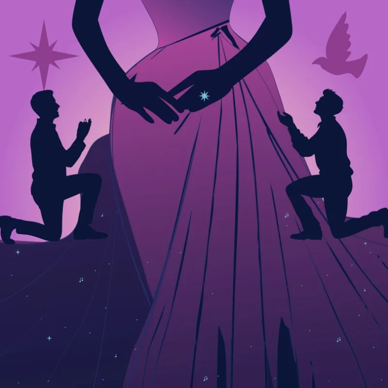
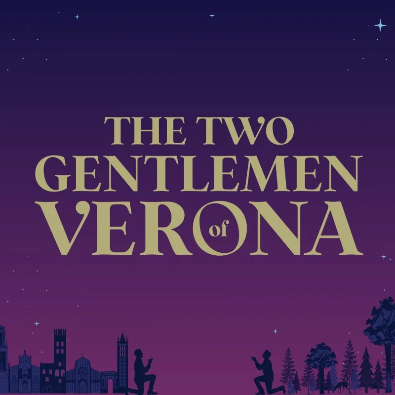
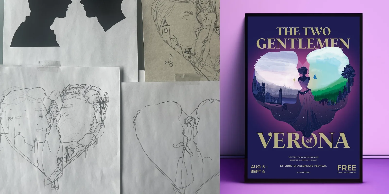
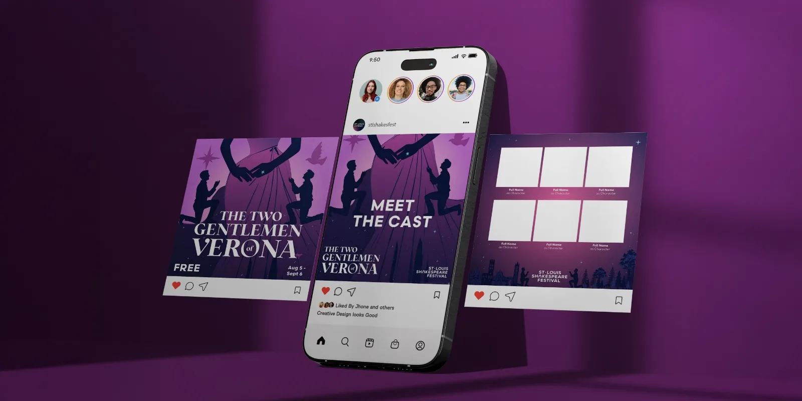
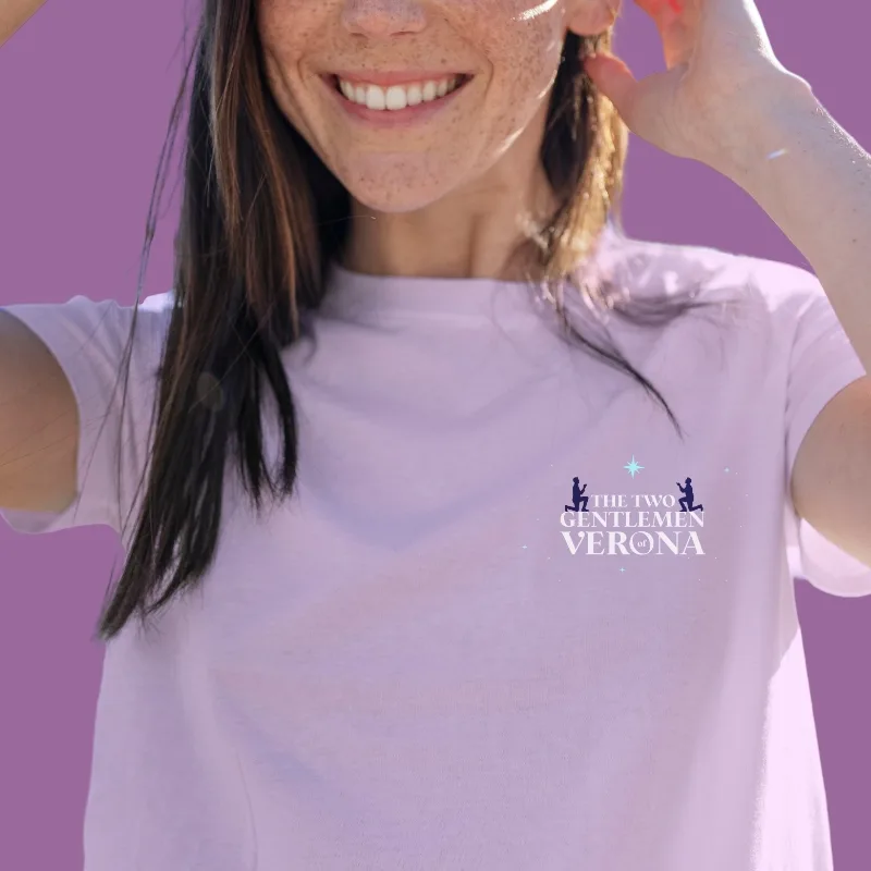
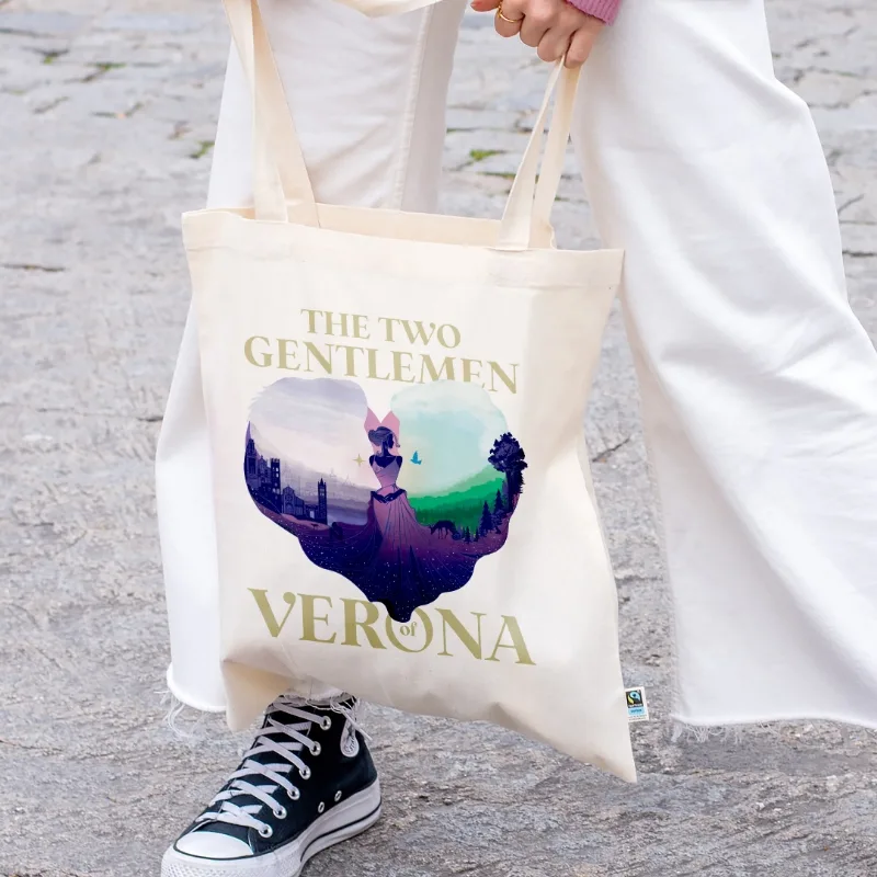
Designers leveraged Two Gentlemen of Verona’s iconic love triangle to pique interest.
Our event marketing company crafted silhouettes of Valentine and Proteus. The dueling protagonists gaze inwardly at the figure of their shared love interest, Silvia, forming a heart. Their heads are filled with two key settings: the city of Verona and a nearby forest.
To connect to the artwork created for The Tempest, the Two Gentlemen of Verona poster utilizes a watercolor treatment. However, it carves its own path with a distinctive color palette and unique icons.
“Paradigm’s vision elevated our entire 2026 season. They helped us see the work through a fresh lens and created a visual identity that’s dynamic, cohesive and distinctly ours. Beyond the work itself, their team was thoughtful, collaborative and an absolute pleasure to partner with.”
Amy Lutz Director of Marketing & Communications
Logo Identity
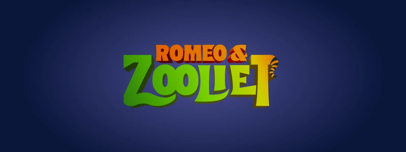
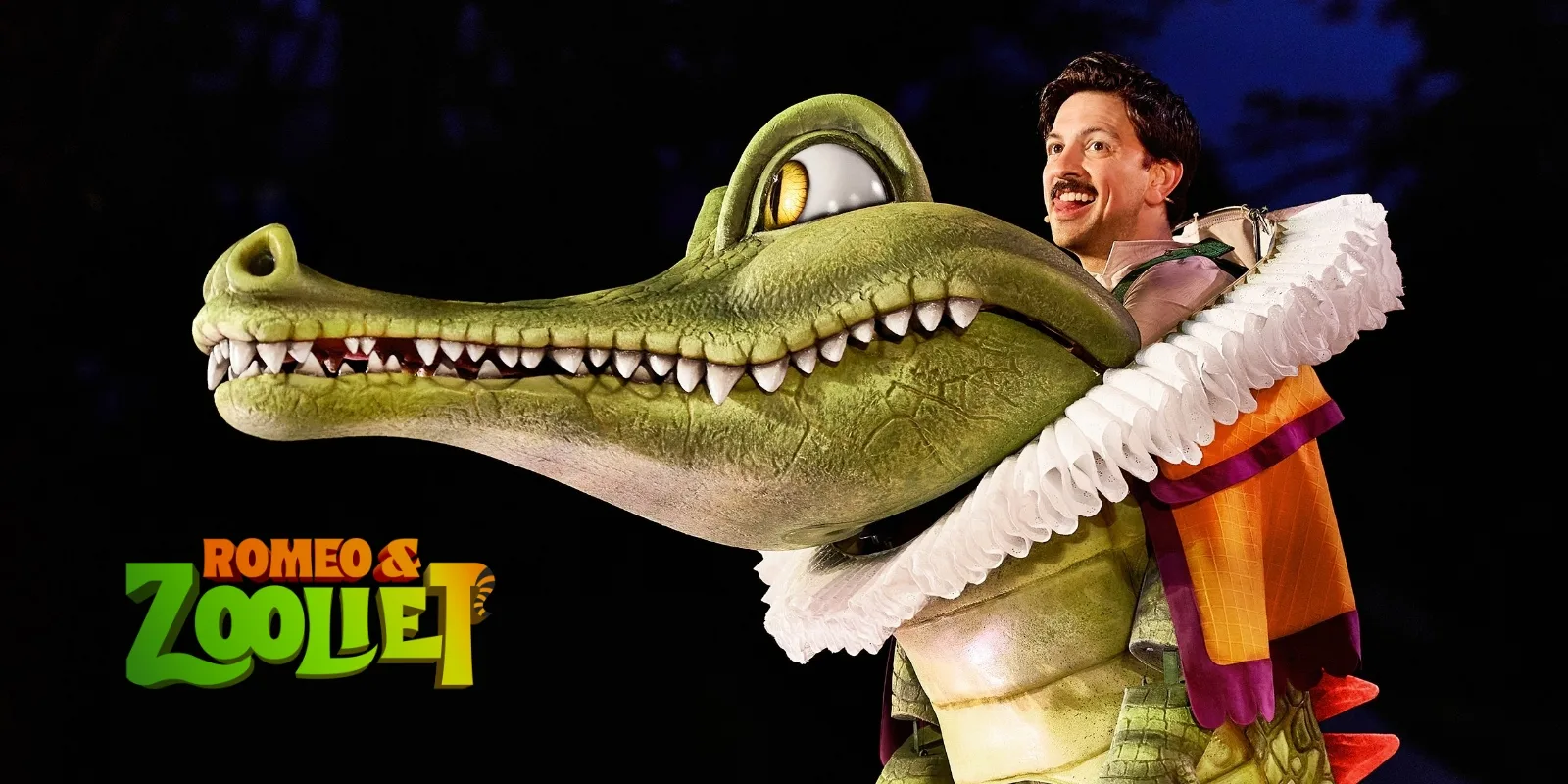
Our logo design relayed Romeo & Zooliet’s audience, content and tone.
Romeo & Zooliet is a family-friendly adaptation of Romeo & Juliet with an unexpected twist. In this version, Romeo is a sea lion, Juliet is a grizzly bear and other characters are similar animal puppets.
Because the production is primarily geared toward children, the St. Louis Shakespeare Festival wanted our event branding services to capture a sense of fun while still feeling modern. In response, our designers delivered a logo with a playful palette of orange and green, a funky three-dimensional font and a subtle tiger tail at the tip of the “T.”
Branding
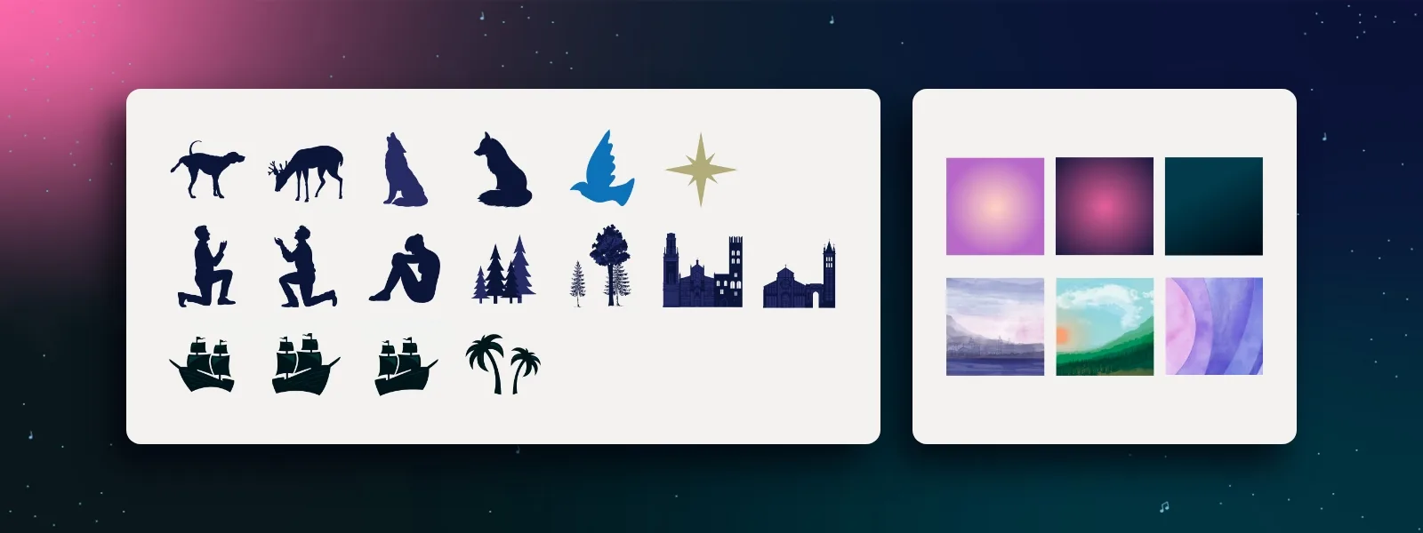
We delivered a simple style guide to maintain brand integrity throughout the 2026 season.
As an event marketing company, we left no stone unturned. Our 2026 season guidelines covered typography, color palettes, production wordmarks and iconography.
Notably, our designers highlighted visual components to share across major productions. The use of stars, music notes, watercolor fills and low-contrast gradient backgrounds would keep all productions visually complementary.