Circle Fiber
Easy all around
Circle Fiber is a fiber internet network delivering super-fast speeds to rural, underserved communities across the United States. But once it was a nameless network dreamed up by Big River Communications — a well-established phone company in Jackson, Missouri.
For anyone who’s ever wished they could do more online.
CHALLENGE
Facing stiff competition from national telecoms, the fledgling internet startup wanted to make a name for itself and establish a dedicated brand platform. It needed a branding agency for startups — so Paradigm got to work bringing the revolutionary brand online.
SOLUTION
Big River Communications claimed that big companies had fallen asleep at the wheel: higher costs, poor speeds and even poorer customer service. They wanted to introduce a network that felt revolutionary, not only in its speed but also in its people. The first step was delving into internet branding — the next, taking on a custom-built website.
Brand Naming
The naming process began with a series of whiteboard sessions among our creative team.
Nothing was off-limits during brand naming. We grouped our name ideas into buckets, ranging from those that played on the parent Big River brand to those that explored a more abstract approach. When in doubt, we referred back to what we felt were the core tenets of the brand: simplicity, openness and connection.
That led us to Circle, a simple shape in which the world’s possibilities can be found.

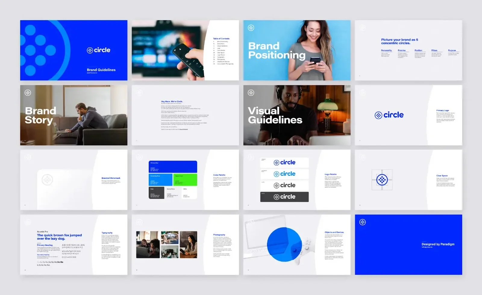
Internet Brand Identity
With the name approved and procured online, we envisioned how Circle Fiber would look, sound and feel.
In the writing stage of internet branding, our copywriters solidified the brand’s core messaging. Circle’s purpose, personality and position featured elements that consumers crave — simplicity, authenticity, community and beyond. By the end, we crafted a brand story introducing Circle and its signature approach: “Easy All Around.”
Even as a branding agency for startups, the Circle Fiber logo proved to be a worthy challenge. After all, how do you elevate such a fundamental shape? Our designers explored everything from the overly simple to the incredibly intricate in pursuit of a mark that would resonate with the brand’s principles.
Ultimately, we moved forward with a mark of smaller circles arranged in a grid inside one larger circle. Our designers admired its symbolism for togetherness and connection. It paired well with a bright green and blue color palette — an internet branding move that strikes a much friendlier tone than the more austere colors used by Circle’s competitors.
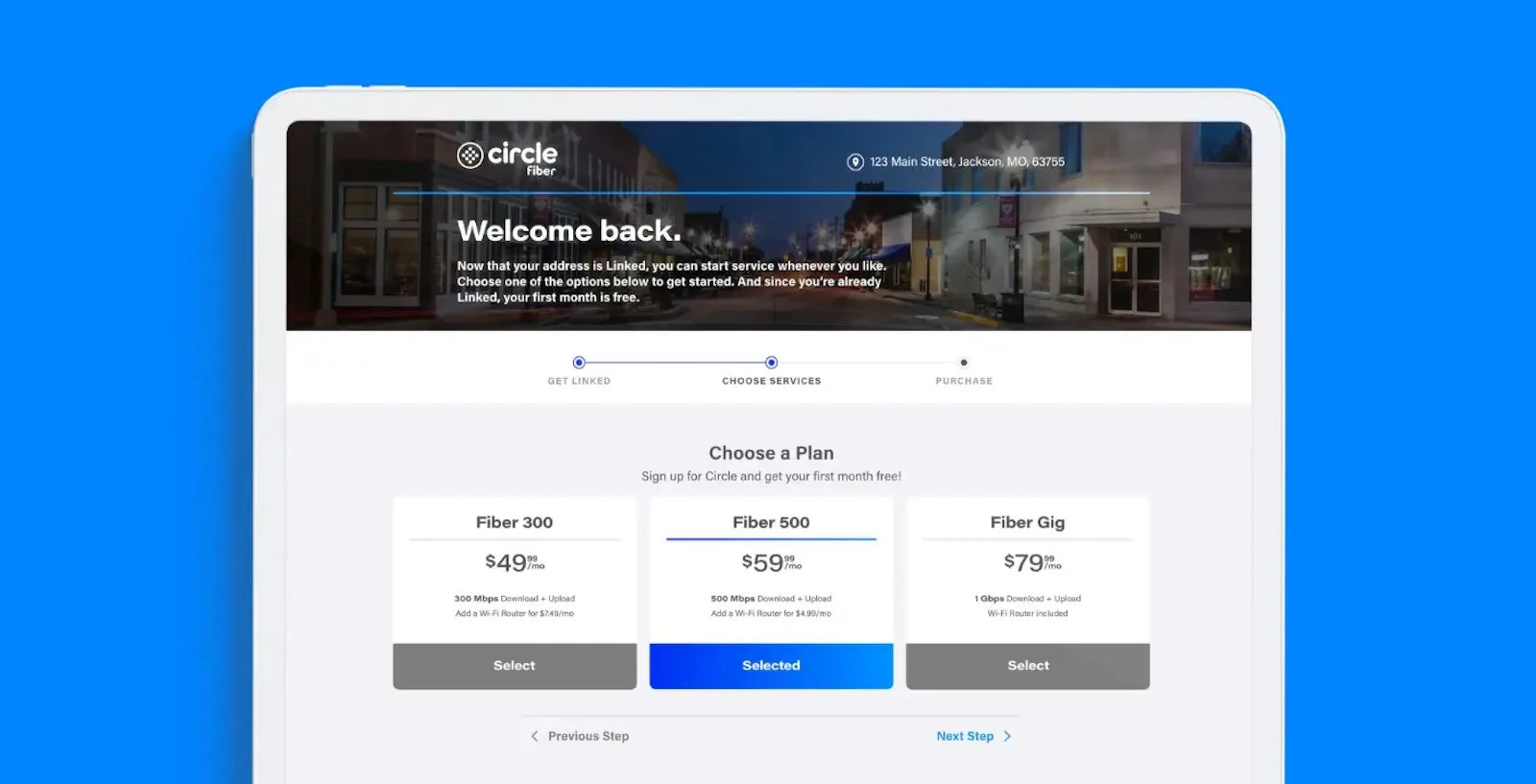
Sales Portal Design
Ahead of Circle’s launch, we took a critical look at the company’s sales portal.
The portal would house the customer’s journey to signing up for service, so it required thought and consideration at every step. Our creative and development teams collaborated on a brand platform experience that funnels customers through the process in a clear, compelling way. We drew on our experience designing e-commerce storefronts to improve engagement and reduce abandoned carts.
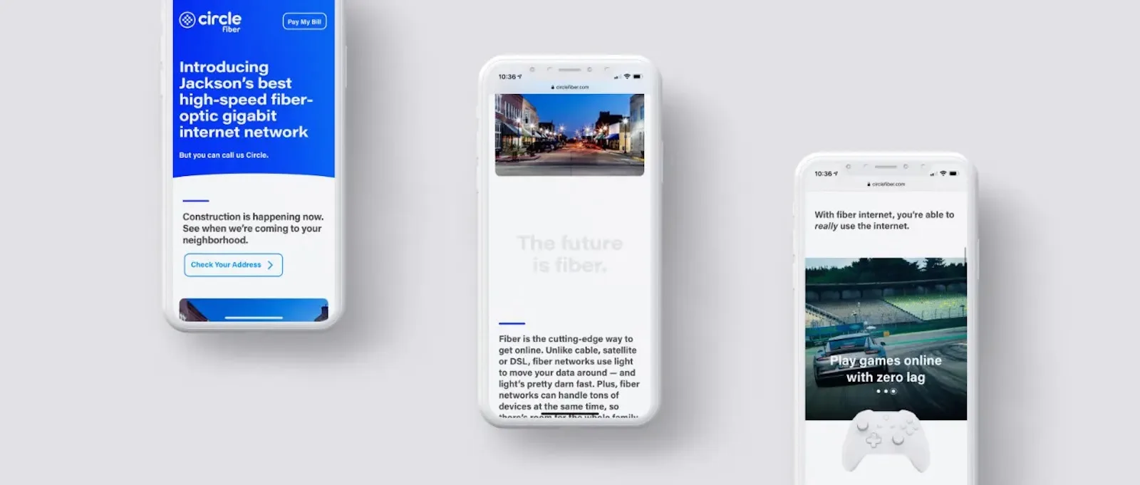
Custom-Built Website
We also took the lead on Circle’s public-facing website.
Recognizing the team’s strategy for a gradual rollout, we followed an iterative approach to the website, starting with a single, multi-purpose landing page and growing it into a more fully baked website. We translated all the key elements of Circle Fiber’s internet branding, from its friendly tone to its distinct colors, onto the website. Given the brand’s emphasis on simplicity, we set out to make its custom-built website a highly intuitive, inviting experience.
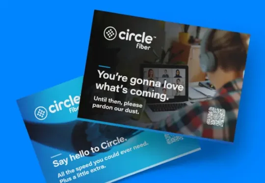
Sales Collateral
With its internet branding and platform in place, we began planning for Circle’s launch promotions.
Circle is all about simple, direct communication — so direct mail was a perfect place to start. We designed door hangers and postcards for distribution throughout Jackson. After those materials were deployed, the Circle sales team followed up in person with residents to answer any questions they had.