Think about the early days of the internet. Everything you read online was either Times New Roman or Arial — maybe Comic Sans if you were lucky. Fast forward to today and things are a lot different. Typography has become more interesting and more abundant as it takes root in new digital experiences. The faces of design legends yore — Helvetica, Bodoni, Futura — are certainly beautiful, but all fonts function a little differently in today’s digital landscape. Here’s how.
There’s a World Wide Web of Fonts
It’s never been easier to find new fonts to use on the web. Google Fonts, Adobe Fonts and other subscription services provide thousands of typography options at little to no cost. For early adopters, this was a great way to make your brand stand out. But now? These services are almost ubiquitous on the web. You may think you’re choosing a rare font — only to find it on another website the next day. For brands seeking a more custom identity, we recommend purchasing a license directly from a type foundry for a font that suits your brand’s distinct tone and style.
One Size Doesn’t Always Fit All
Back when typesetting was a physical process, typefaces were designed in multiple optical variants to maintain legibility at different sizes. Some legacy fonts are still licensed with these variants, like Bodoni Six and Bodoni Twelve. But as typefaces became digitized, this became less common.
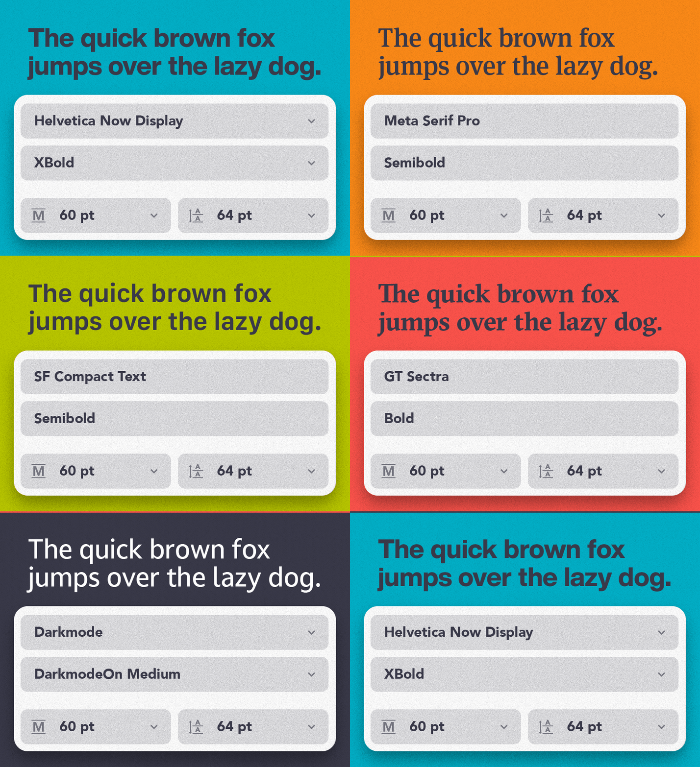
What we’re seeing now is history repeating itself. With every new screen size on the market, typography has to evolve and accommodate the reader. In 2015, Apple released a new typeface, San Francisco, that included a version specially designed for the Apple Watch’s small screen, “SF Compact.” More recently, foundry Monotype has redesigned both Helvetica and Futura to incorporate Text and/or Micro alternatives that work better on smaller devices.
Today’s Typography Moves
Yet another breakthrough in digital typography, variable fonts went mainstream in 2016 and are now supported by most browsers. Variable fonts let you customize several aspects of the typography using sliders. For bold brands, they can be used to create eye-catching headlines using letters that modulate in size and form. Variable fonts also cut down the total size of the font and help increase your website’s page load speeds.
Some Fonts Embrace the Dark (Mode)
Few topics in UI/UX design have sparked more interest than dark mode. Just last month, Google added a dark mode to its desktop search page, one of the world’s most visited pages. But dark mode presents one challenge: text feels slightly larger on dark backgrounds compared to light backgrounds. Type foundry Dalton Maag set out to alleviate this challenge by creating a variable typeface. This type offers “DarkmodeOn” and “DarkmodeOff” options that slightly modify the boldness of each letter depending on the background.
Others Are Truly Iconic
Most major brands are now collaborating with type foundries to create completely custom typefaces. Leading brands like Netflix, Apple, YouTube and Burger King all use fonts you won’t find anywhere else. In some cases, typography is one of the best vehicles for brand expression. Just look at Popeye’s and its distinct font, Chicken Sans. As expected, custom typefaces come with a higher cost, but for the right brand — their value is priceless.
So, How Do I Pick the Right Typeface?
Good question. It starts with getting to know your company inside and out. Understanding your brand’s aspiration, audience, tone and style will generally point you in the right direction. From there, you should consult a design team to zero in on a typeface that will carry your brand’s message to its fullest potential. Not sure what that message is? Get in touch with us. We’d love to show you.


