WWDC 2021’s Impact on Web Design
06.10.21
Each year, Apple brings developers, designers, tech lovers and Apple fans together for its Worldwide Developers Conference, also known as WWDC — or just “Dub Dub.” WWDC is where Apple shows off the latest software for all of its devices, from MacBooks to AirPods. This year we saw macOS Monterey, iOS 15 and plenty more.
WWDC’s Impact is Wider Than Just Apple
When nearly half of all U.S. smartphone owners have iPhones, every change is bound to make headlines. This year’s WWDC theme was iteration over revolution. Where Google introduced some sweeping visual changes with its recent Material You announcement, Apple has chosen to refine its existing Human Interface Guidelines — particularly with the Safari browser. Let’s take a look.

Images and animations by Apple. https://www.apple.com/apple-events/june-2021/
Safari Giving More Focus to Content
Safari is taking another step toward minimalism by changing the way it presents tabs and the search bar. Apple’s goal is to reduce the visual weight of the browser and put web content front and center. Both iPad and desktop versions of the updated Safari will give even more space for the website — but that’s just the beginning.
Images and animations by Apple. https://www.apple.com/apple-events/june-2021/
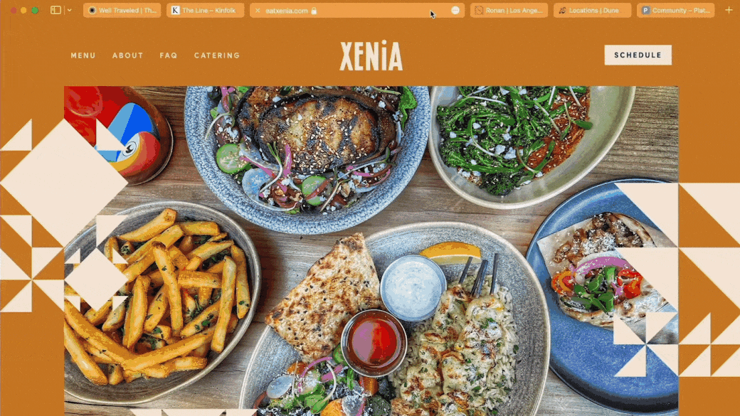
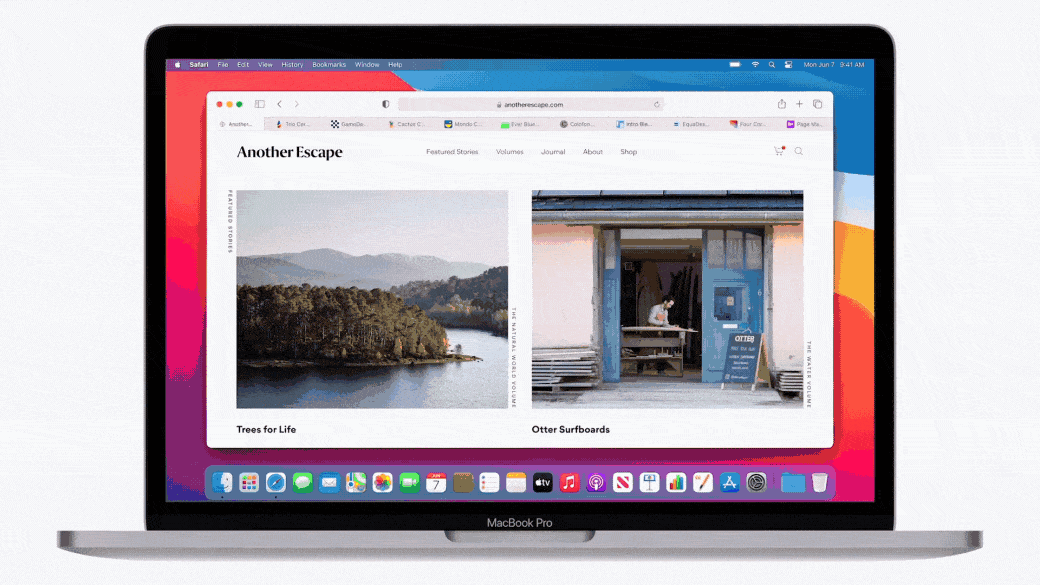
The Tab Bar Is Now an Extension of Your Brand
Back in 2014, Android added “theme colors” to the mobile version of Chrome. It allowed developers to add color to the search bar and make the experience more seamless and branded to the site. Apple unveiled a similar feature for Safari at WWDC and it’s a safe bet that it’ll look just as striking on Apple devices. The feature was very underutilized on Android, but now that it’s on iOS, developers and designers are more likely to implement it.
What’s all this mean for your brand? To put it simply, every website just got some free real estate. And those sites that make good use of the space are going to stand out to visitors.
Here are three quick ways to use the new tab bar:
- Extending the color of the navigation bar or background color to create a seamless transition from browser to website
- Add a pop of your brand’s color to an otherwise neutrally colored design
- Ignoring the feature and letting the browser use its default style
Implementing the New Tab Bar
We’re excited to get our hands on the new tab bar, but we’ve identified a few reasons it could be tricky to implement. First off, it seems to only add a solid color. Websites that feature an image or texture at the top of the page might not get that seamless look that Apple showed off in the keynote. Second, now that there’s no clear separation between the page and the browser, some sites may need to tweak the size of their navigation bar to prevent it from looking too large or to give a bit more space between your menu and the tabs above.

Images and animations by Apple. https://www.apple.com/apple-events/june-2021/
Favicons Are More Important than Ever
Safari will now only show a favicon on inactive tabs on desktop and iPadOS by default. A favicon is that tiny icon you see on each browser tab. It’s usually paired with the title of the web page you’re on, but that won’t always be the case now. Your favicon needs to be able to stand on its own. Consider contrast for a browser’s light and dark modes as well as how theme colors may affect the legibility. Otherwise, a user may not be able to quickly recognize your site among the other tabs they have open.
The updates to Safari’s favicons may also play into logo design in some capacity. Logos have always needed to be recognizable at small scales, but now that a favicon is the only way to identify your brand in a crowd of tabs, you’ll benefit from a logo that can be reduced to a tiny square and still look familiar to the user.
Images and animations by Apple. https://www.apple.com/apple-events/june-2021/
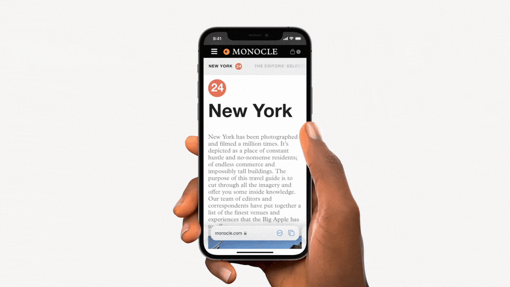
You May Need to Restructure Your Mobile Design
Ignoring the ability to color the tab bar won’t make or break your web design, but this just might: Safari on iOS has moved the primary navigation bar to the bottom of the screen. This presents a user experience challenge for websites that leverage the bottom of the screen for links or important information. For example, sites that place the familiar “Sign Up” or “Add to Cart” button at the bottom of the screen could find that their critical calls to action are now covered by the navigation bar. You may need to get creative with the code that’s placing these elements if you find they’re harder for the user to see on iOS 15.
Images and animations by Apple. https://www.apple.com/apple-events/june-2021/
Overall, We’re Excited About the Safari Updates
In our world, change is what keeps us alive. It’s an opportunity to try new things, learn new skills and maximize the potential of every site we build. Who knows, your next website could be the first we build with these new Safari features. Reach out to us and let’s talk about how your website can work even harder for you.