Built for Life: Brand Identity for Hastings + Chivetta
Share:
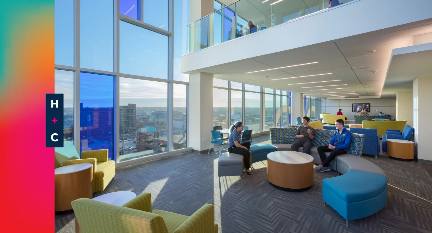
You never forget the first steps you take on your college campus. Each step fills you with pride for where you are and ambition for what’s to come. Those feelings aren’t by accident. Teams of architects, designers and engineers spend decades cultivating them with every new building. And at over 200 campuses nationwide, those teams have included Hastings + Chivetta.
Hastings + Chivetta is a full-service architecture firm with deep expertise in campus design. Think classroom buildings, residence halls, research centers, recreational facilities. If it sits on a campus, they’ve likely built one. As the firm grows its national footprint, it needed a brand identity that told their story and better reflected the thought and expertise they place into every project.
Throughout an all-day discovery session, that story began to take shape. There are architecture firms that work on college campuses, and then there are campus architects. Hastings + Chivetta is proudly the latter, bringing a far more wide-reaching and holistic approach. With each project, the H+C team is not only designing a building, but also changing the very fabric of that campus for generations to come.
This revelation became the foundation of our brand concept. For all its concrete and pavement, a campus is a living organism. It’s where people of all backgrounds come to learn, work, live and play. So as campus architects, it is Hastings + Chivetta’s responsibility to understand and evolve that life.
We distilled this concept into a brand narrative that set the tone and direction for Hastings + Chivetta’s new visual identity.
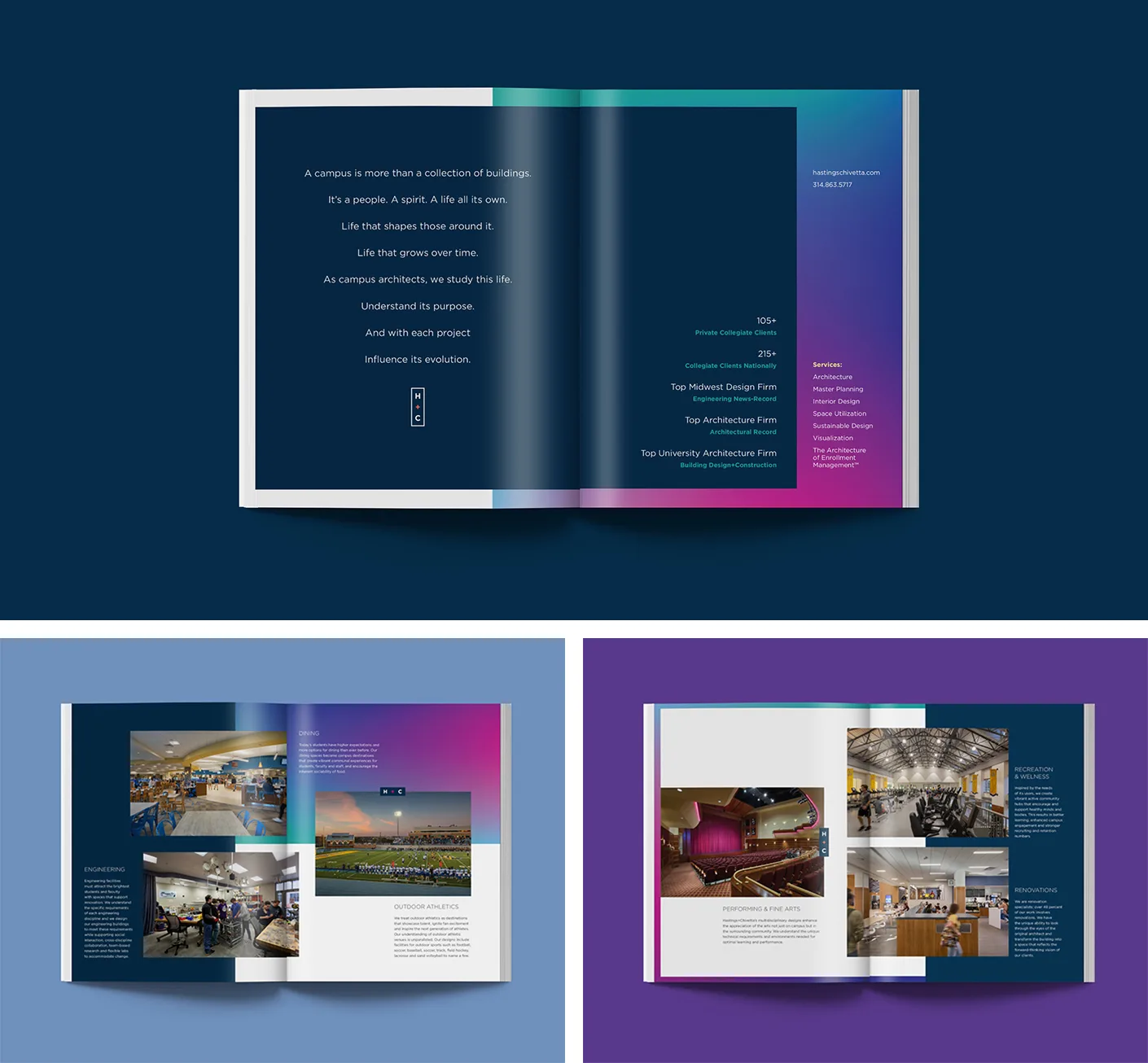
A campus is more than a collection of buildings.
It’s a people. A spirit. A life all its own.
Life that shapes those around it.
Life that grows over time.
As campus architects, we study this life.
Understand its purpose.
And with each project,
Influence its evolution.
With nods to biology, we designed a logo system that physically adapts to different materials. We referenced heat maps and included a set of gradient curves that add an organic element to the brand. Combined, the logo system itself becomes alive with a nearly endless number of ways to feature the logo and color palette.
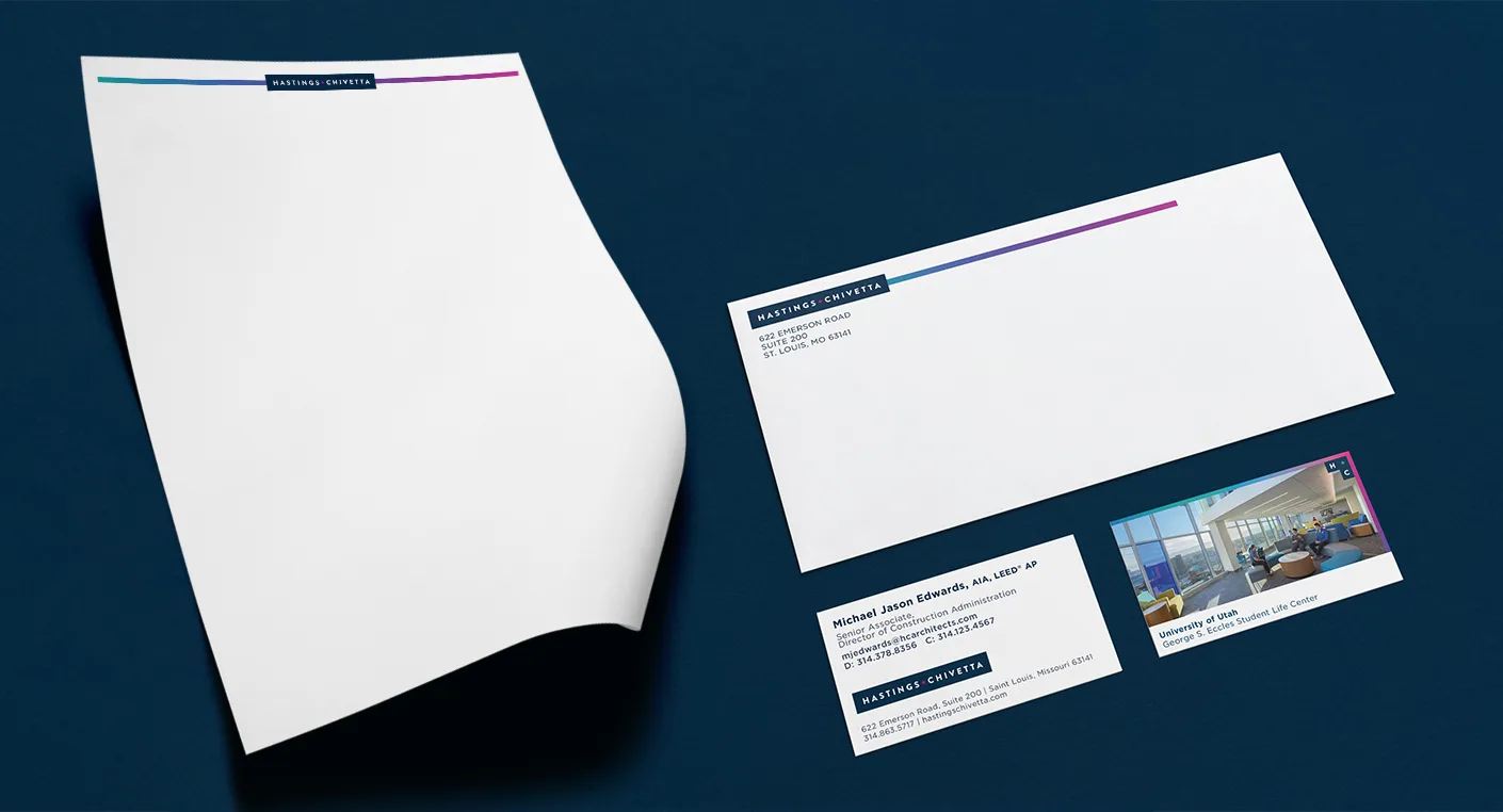
Since wrapping the logo project, we moved on to design some of the firm’s key collateral: business cards, marketing proposals, sales presentations and more.
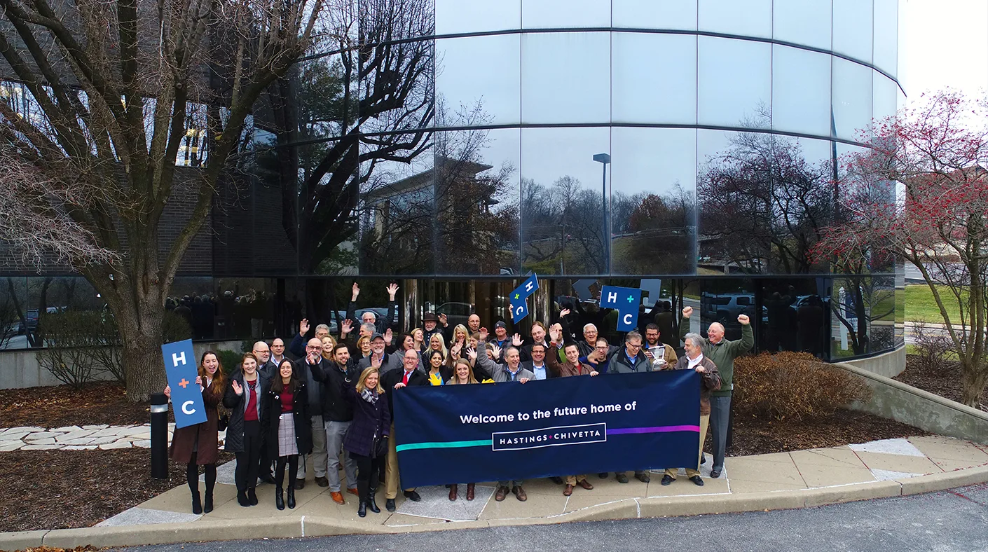
It all begins rolling out today and we couldn’t be happier for the team at Hastings + Chivetta. Congratulations to all of them as their name takes on a new life.
Let’s Turn Insight Into Action
You’ve seen how we think. Now let’s talk about how we can help move your organization forward.