Inbound marketing strategies help brands drive leads to their presence online. These strategies increase brand awareness, brand engagement and lead conversion. Many of Paradigm’s clients are actively applying these strategies in reaching their targets.
Every company is distinct requiring a range of marketing channels and approaches. Using inbound strategies, our clients have made smarter marketing decisions to improve their bottom lines. Altogether, this push for a more robust inbound marketing methodology has improved our clients’ ability to engage and acquire new business.
Our Inbound Team is

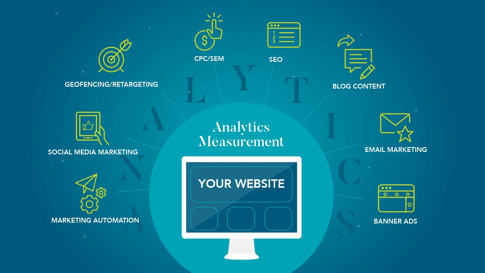
Analytics Measurement
Better decisions are made when the data is in front of you. After all, how can you truly know how well your marketing initiatives are doing without tracking them? Beginning with a data-driven approach guides marketing decisions through measurable results. When data is showing an adverse affect of a new marketing campaign, we will know to recalibrate and pivot the strategy.
Analytics measurement is at the core of every marketing initiative, and is the launching pad for every other inbound marketing tactic.
Our Google Analytics Certified team of professionals assist with setting goals, analyzing metrics from multiple platforms, drawing correlations, and recommending strategies for implementation.
1. SEO Management
Search engine optimization (SEO) is simply unavoidable. As I am writing this, there have been 2.3 billion searches on Google, just today. Companies should be doing all they can to promote their website high in Google’s ranks and maintain a competitive edge against the sites of rival companies.
Our team of SEO experts are constantly monitoring major search engines for algorithm changes, crawler bot habits, and newly found SEO best practices.
SEO health is more than just using appropriate keywords, it’s a collection of messaging, design, and coding strategies intertwined into a fully optimized website.
Optimizing your site’s SEO is just as important as measuring analytics, as this is the most consistent way to grow your website’s traffic and your brand’s reach.
2. Marketing Automation
The rise in marketing automation has given companies a chance to manage many of their marketing initiatives on one platform. As convenient as these services are, they also provide a common challenge: They are time-consuming.
To really get the most out of marketing automation, you need dedicated professionals managing it consistently.
However, the benefits to marketing automation are truly endless. To help our clients make the most of it, we have taken the reins. Our dedicated inbound team pieces together results-oriented strategies for email marketing, social media marketing, landing page creation, CRM (customer relationship management) tools and much more.
A core efficiency of marketing automation is the built-in CRM (customer relationship manager) that informs business developers with valuable inline lead tracking analytics. Saving marketers and sales professionals time by replacing disparate toolsets with a unified tool affords more time for identifying and communicating with leads.
Another key feature of marketing automation is landing page creation. Our team constructs landing pages for each of our client’s campaigns. These pages function as a conversion point that guides visitors to the end goals. Landing pages are used in a number of different types of inbound marketing. Knowing how to use them effectively in conjunction with marketing automation will help set a course for heightened conversion.
3. Email Marketing
A pillar of marketing automation is email marketing. Due to its complexity, great email marketing has evolved to an art form.
There are dozens of criterion to consider when constructing your email campaign: The creative, the messaging, the article placement, the landing page, the “calls to action” (CTAs), the personalization, and the time/date you send it.
Yet, when you perfect each of these elements, you are left with a masterpiece of marketing.
Our combined experience in email strategy, design, and development all result in campaigns that fit any client’s strategy. Learn more about our email marketing capabilities.
4. Banner Ad Campaigns
Banner ads are some of the most targeted campaigns you can run. Whether driving brand awareness or striving to increase lead conversions, we create messaging and designs that get noticed and engage viewers where they live and work. We help manage broad geographic reaches and smaller niche areas, whether it means targeting a 15 mile radius around downtown Chicago, or a convention center in Las Vegas.
This pushes brand recognition to your target demographic, and it draws engaged visitors to your website.
We’ll take it a step further and re-target these visitors to keep them coming back to the site. We create landing pages for each visitor profile. The page’s content changes based on the campaign. Different copy and CTAs are used for awareness banners than is used for re-targeting campaigns. We use a strategic, data-driven approach to the creative design and development of each landing page to ensure successful conversion rates.
Our strategies for creating and implementing banner ad campaigns, have our clients experiencing continued growth in their website traffic and overall engagement when running these campaigns.
5. Geofencing & Retargeting
A specific type of banner campaign engages your audience on their mobile devices within a specifically targeted geolocation. By capturing audience information during a planned window, your audience may be narrowed and identified by demographics and psychographics alike.
A practical and popular use is targeting trade show attendees within a specific geolocation (ie: the convention center) during the entirety of the trade show event. Then re-engage the attendees post-event with retargeting ads on their mobile devices bringing them back to your site’s landing page for a purchasing decision.
Reach your target audience where they are most engaged with your topic matter. Then re-target them with brand messaging and conversion opportunities for campaign duration.
6. Cost-per-click (CPC)
Like banner ads, another way we push brand recognition is through Google AdWords and CPC campaigns.
CPC provides brands with a way to set a budget and keyword strategy to place their website above search results in popular keyword searches.
Our strategy team guides you in determining which keywords to use and how many to place into each campaign. Our analysis provides insight on what changes to make in order to strengthen the campaign. Much like with banner ad campaigns, we construct different landing pages around the keyword groups in CPC campaigns.
All in all, CPC is an excellent way to drive qualified traffic to the site, as well as to build upon your brand awareness.
7. Blog Strategy
Every company should create fresh content…if you want to be found in search, you’re basically in the content business. Many choose to do this in the form of blog writing. Writing blogs helps establish your brand as the thought leader in your industry.
The more you write about your industry segment, the more authority you gain from both site visitors and search engines.
Blogging also helps with SEO. The more articles you write about problems or issues your target audience faces, the more qualified leads visit your page. Search engines will recognize that your domain is a popular solution for industry questions. This improves your ranking in search engine for those related keywords.
Blogging is the best way to quickly and effectively produce content. Our blog management services will assist you with editorial calendar development, post scheduling, content ideation, interviews, research, writing and SEO strategy.
8. Social Media Marketing
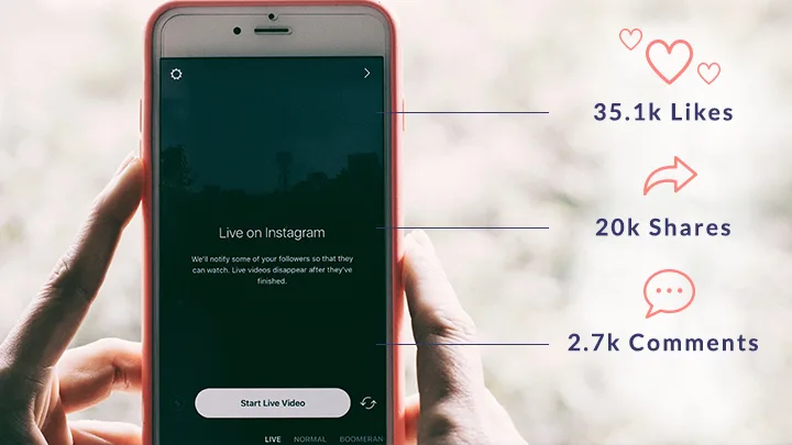
Social media is a powerful tool to leverage if only due to the immense number of people using it daily.
All major social media channels allow for brands to create targeted and branded messages for a number of targets and end goals.
We create campaigns to generate website traffic or build your presence through any social media platform. These campaigns will reach a targeted audience to show off a personalized brand message and image. This attracts people to take specific actions via your site.
It is difficult to know which social media platforms your brand should embrace. Let our inbound team put together a social strategy for your company.
How to Get Started
We are finding that every business can benefit from just one or a combination of these tactics. Each of these strategies work in concert to engage your targets and bring their attention to you. Marketing strategy has evolved to a more personal and measurable level. We recommend walking before you run by first taking steps to analyze your metrics in defining a strategy most appropriate for your brand.
Contact us to learn how we may help you develop an inbound marketing strategy.
