Allogroom
Allogroom is a social feedback app designed to help professionals collect anonymous feedback from a trusted group of peers.
Role
- Logo Design
- Branding
- Mobile App Design
Industry
- Social Media
Challenge
Allogroom wasn’t just a new app — it was a new kind of app. Apps like LinkedIn have historically been used for professionals to communicate, but Allogroom offered a new approach based on anonymity. Users could evaluate personality traits and ask questions without fear or judgment, all in the spirit of honesty and positivity.
As it prepared for launch, Allogroom needed a brand identity and app design that would instantly connect users with its unique brand of social networking.
Logo Design
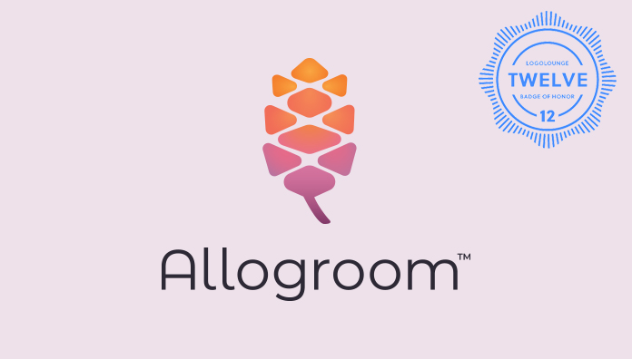
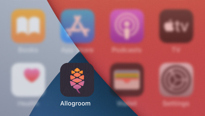
Allogroom’s logo features a stylized sequoia seed. The sequoia is known as the tallest tree species in the world, yet it starts as a small seed like any other. The seed had an interesting geometry to it and we felt, with the right touches, could stand alone as a symbol of aspiration and growth. We rounded out the logo with a modern type treatment and bright color palette reminiscent of flowers blooming in the spring. The Allogroom logo was even featured in the 12th edition of LogoLounge, which highlights some of the best logo designs from around the world.
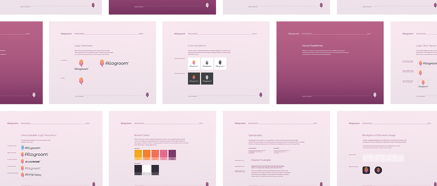

Allogroom was designed to connect users with valuable feedback that would enable personal and professional growth. The idea of growth particularly resonated with our team, especially in the broader landscape of social networks. Most apps, like Facebook and Twitter, draw on connection and togetherness in their brands. With Allogroom, we saw an opportunity to illustrate the end goal of a user’s connections.

Tagline
We paired the Allogroom brand with a tagline: Open Up. Allogroom believes good things come to those who put themselves out there and its tagline needed to reflect this core belief.
We found “Open Up” to be just the right balance of soft confidence that would encourage others to drop their walls, let others in and see what Allogroom was all about.
App Design
With the brand identity set, we moved onto the app design. Our primary goal was to create an intuitive experience that differentiated the app as a new type of social platform. Other apps emphasize personal content, but Allogroom is more about personal growth. So instead of photos and updates from your friends, your Allogroom experience needed to prioritize information that was specific to you.
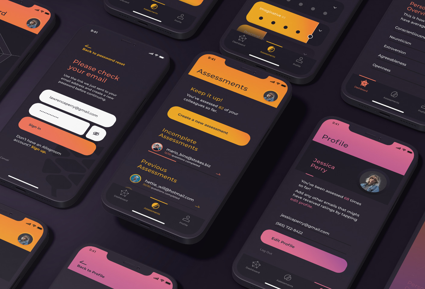
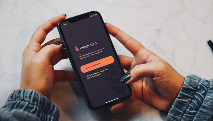
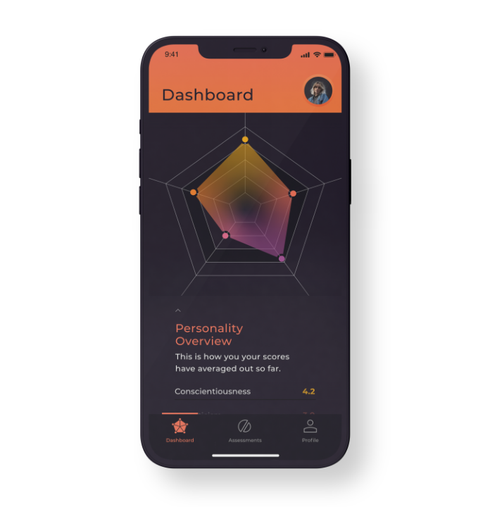
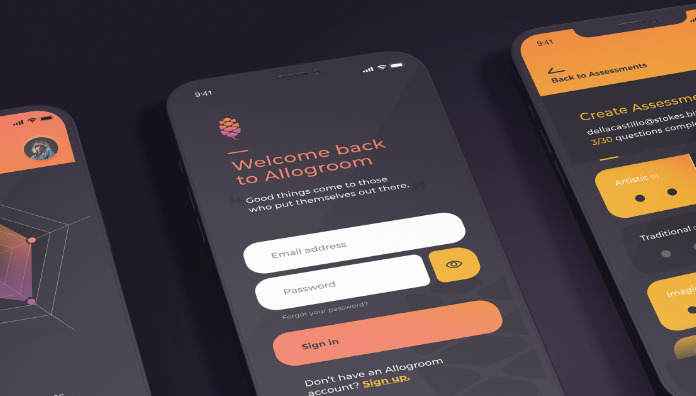
When you open the app, you’re greeted with a dashboard featuring a personality matrix based on peer feedback. Each subsequent screen is very intentional with few elements for distraction, allowing users to easily access the tools they need. Throughout the experience, we leaned on Allogroom’s deep slate color to reinforce its position as a place for personal growth and honest reflection.
Next
Edgeium
