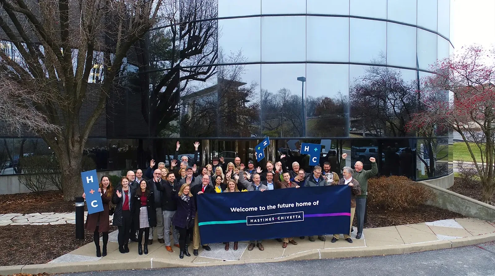
Hastings + Chivetta
Architecture, planning and interior design
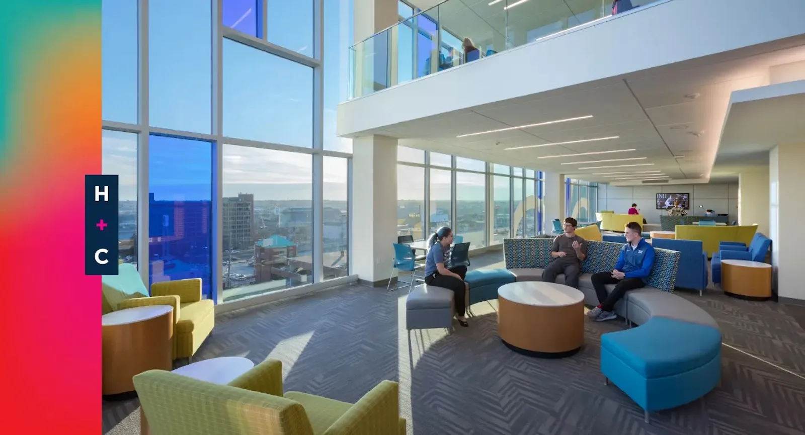
Space profoundly influences the way we live — a phenomenon often overlooked, yet intuitively felt. At colleges and universities across the country, these carefully crafted spaces and sensations are designed by the team at Hastings + Chivetta.
Built for life
CHALLENGE
Founded in 1960, Hastings + Chivetta worked through several industries — government, commercial, healthcare — before finding its niche in campus architecture. But as universities faced pressure to develop top-tier facilities with tighter budgets, H+C needed architecture firm branding that would reassert its value for campuses nationwide.
SOLUTION
Paradigm drew on its experience in digital marketing for architecture firms to overhaul Hastings + Chivetta’s brand. The result was an identity that reflected its passion for shaping campuses and elevated its reputation to the level of its larger, national competition.
Brand Identity
Discovery sessions revealed common threads between the work H+C loves and the clients it attracts.
It’s one thing to have the capacity to do something and another to make it your specialty. Any architecture firm can build on a college campus. Yet, only a handful can study that campus, understand what makes it unique and change its fabric for years to come.
We built this architecture firm branding project on the idea that a campus, for all its concrete, metal and glass, is a center of life where people live, work, learn, grow and play. Our brand copywriters positioned the firm as campus architects who shape this life and foster its growth over time.
Digital marketing for architecture firms needs a concrete direction — and our brand narrative effectively set the tone for messaging and design.
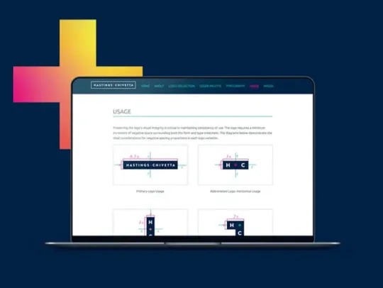
Logo Design
Much like life itself, H+C’s logo is a fluid system.
Our brand designers crafted logo variations akin to Tetris blocks — allowing the brand to physically adapt to different environments. The logo is supported by a series of gradient fields that add a warming, organic element to the brand.
When combined, the logo and color palette create endless ways to display the Hastings + Chivetta name.
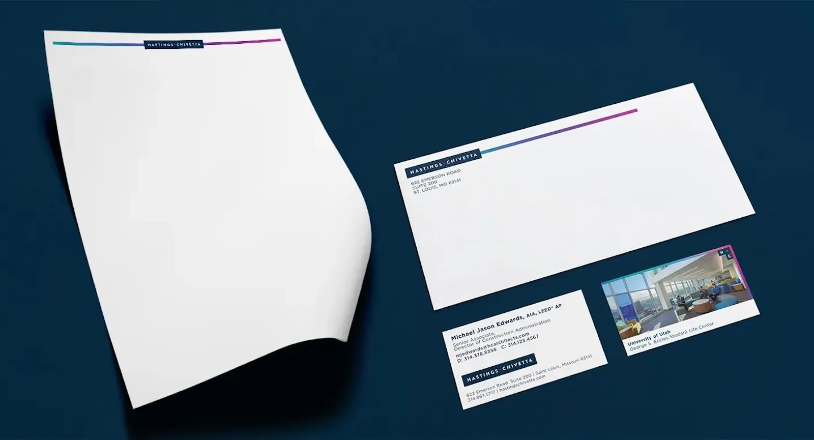
Business Collateral
We developed a full suite of business collateral as we activated the new Hastings + Chivetta brand.
Our design team developed a suite of brand collateral for the firm, including business cards, letterheads and envelopes. Each piece leads the way for the H+C team to introduce their new identity at even the smallest, earliest interactions with campus representatives.
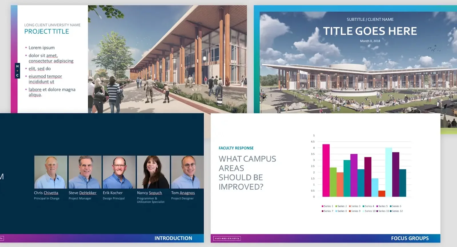
Sales Presentation
Architecture comes with a certain degree of showmanship.
As firms pitch exciting new sports arenas, state-of-the-art laboratories or five-star dormitories, they do so with a level of flash and style that’s rarely seen in other industries.
The launch of H+C’s new brand identity presented an excellent opportunity for us to rethink one of the firm’s first long-form presentations to prospective clients. The updated presentation applies the new architecture firm branding while focusing on clean, informative slides.
Marketing Proposal
Before putting pen to paper, clients want to know they’re in good hands.
Physical marketing for architecture firms conveys a level of professionalism that will either make or break a deal. As such, we proposed redesigning the firm’s marketing proposal to better tell its story and elevate its client experience.
The result was a revamped proposal with eye-catching visuals and a greater emphasis on storytelling. With this asset in hand, H+C instills the confidence needed to sign off on a project.
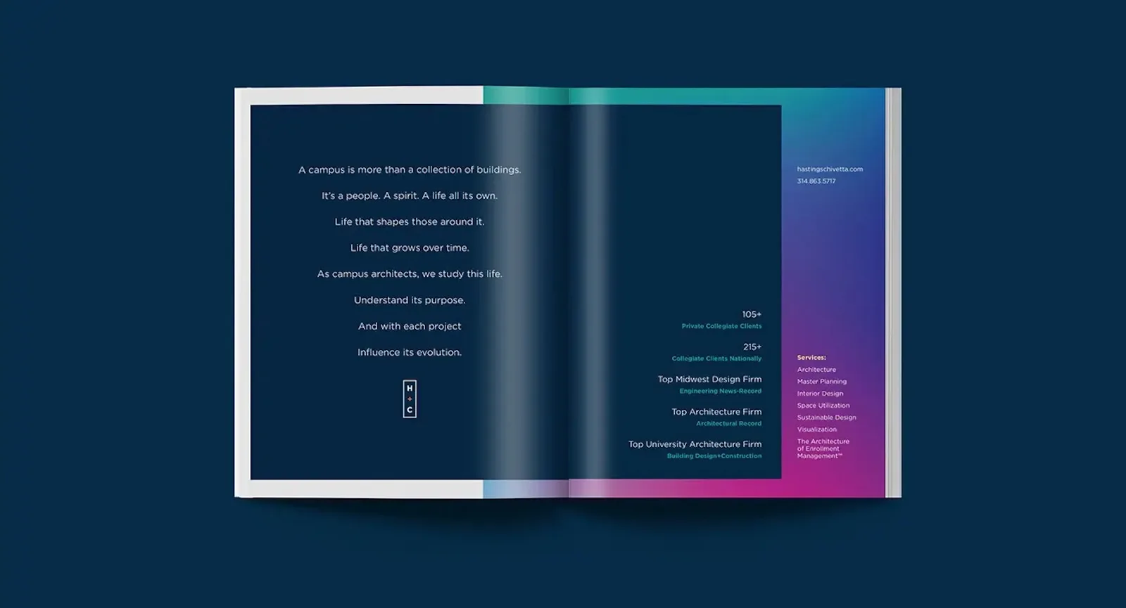
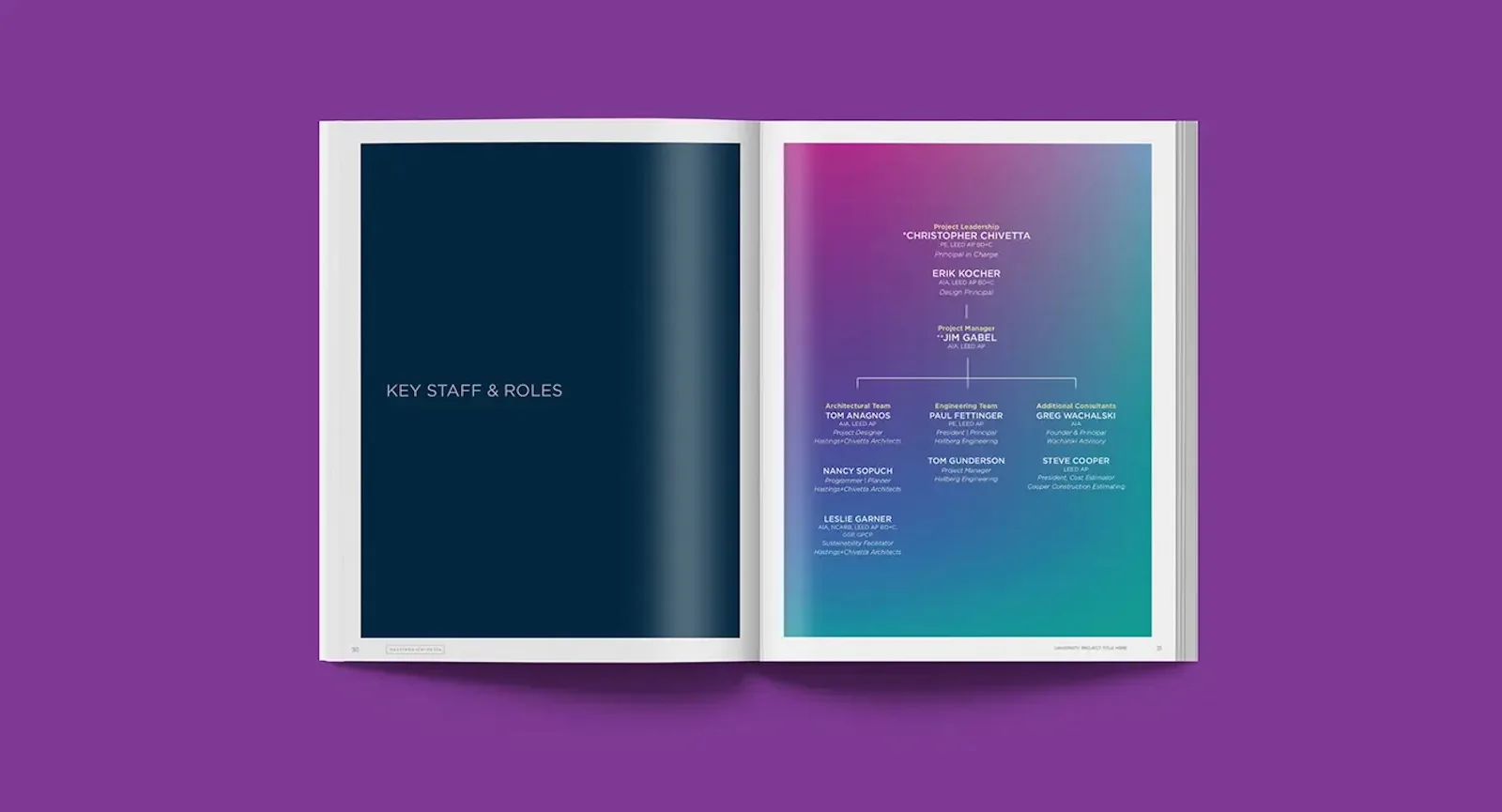
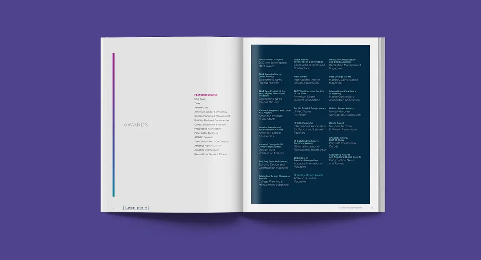
Brochure
First impressions are everything, especially in architecture.
We wanted to ensure H+C made a positive first impression on prospects. We left no stone unturned, redesigning H+C’s marketing brochure to introduce the firm and its services.
The new brochure opens with a brand narrative that conveys a core message: H+C’s focus extends beyond individual buildings. Environmental photography and elements from H+C’s architecture firm branding support the message and guide readers through everything the firm has to offer.