Beauty Restored – Rebranding Huffords Jewelry
02.10.15
One particular approach that we take in our rebranding projects at Paradigm is to merge heritage with modernism. There’s a richly distinct, imperative value in upholding tradition that we like to preserve, especially when it comes to our more storied clients. Huffords Jewelry in Frontenac is no exception. Our directive: Shedding light on the new generation to step up and take the proverbial ‘reigns’ over the famed horse-drawn carriage mark, while retaining the elegance of generations passed.
Ravaged by Time
The Huffords’ tradition has been passed down from the generations – growing in business, but with each passing year of duplicating, printing, editing and re-printing, their logo and typeface had not managed to age as gracefully as their reputation. We needed to maintain as much of the original Huffords’ iconic integrity as possible while addressing their visual branding trouble spots.
“We’ve had the same logo for over 60 years, but never had a modern rendering of it,” explained Dan Hufford, the jewelry store’s third generation owner. “In fact, all we had was an old blurred copy. So I knew it was time to have a updated mark created incorporating a consistent color palate to be used in all of our marketing and advertising. Paradigm did a beautiful job designing our website;s visual branding so they were the obvious first choice.”
Getting Creative with Revitalization & Tradition
After approaching us with their challenge, we immediately sought to restore, polish, and present Huffords with a cleaner, modernized, and accurate version of their life’s work.
Our resident Design Director, Charlie Culella took to re-establishing Huffords’ typeface and logo as one would approach the restoration of an old photograph or painting. “As a designer, the most challenging aspect was modernizing a well-known logo without losing the equity,” Culella noted. “It was rather fun going from pencil sketches to computer illustrations, but slightly maddening to go to final tweaks on a micro level to achieve just the perfect balance or curve.”
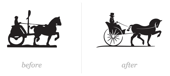
![]()
The classic, but age-blurred logo featuring a horse and carriage, after careful creative and restorative work, transformed into a sleek representation of an immaculately dressed man in a carriage, pulled by a well-groomed horse.
“The lines are highly geometric and gestural demonstrating balance and just the right amount of relevant detail. With the attention paid to the balance of simplicity and detail, the mark reduces to a minimum of 1″ without losing graphic integrity. Which makes it perfect for packaging and subtle print work,” elaborated Culella. “And a sleek, sans-serif font gives the logotype versatility and clean lines maintaining flawless centered stacking.”
50 Shades of Blue
Finding a balance between legacy and leading-edge is not the simplest of tasks, but after applying our discussions with Huffords, we dove deep into identifying how we would turn dreaming into a palette that uniquely reflects the luxury and quality of the brand. The Huffords color palette, while luxurious, needed to be set apart from the rest.
“We wanted to remain true to the Huffords deep blue while pairing it with an array of accent colors,” he added. “To make the blue the hero, there is a light and dark set of warm grays to ground the palette, giving it a base to work with. The light steel blue rounds out the top range of the color palette sets the dark blue up with something light to contrast against.”
![]()
In addition to the blue palette, the Huffords brand colors are warmed with accenting bronze, which would be represented in a metallic ink or foil for print pieces, lending to its sophistication.
Simple Sophistication
“My favorite part was seeing something that I never could have imagined, but was everything I was looking for,” remarked Hufford. “The logo is crisp and modern and conveys the integrity and luxury that Huffords has always stood for. The colors are unique to our competition, yet classic.”
When the results surpass our clients’ expectations, and even go above and beyond what we dreamed possible, that’s what we’re in business to do. Much like the branding work we do, we learn from our past experiences, and always look to grow through our trials, pursuing exciting new projects, and continually pushing the envelope of creative.
“You can get lost in it for a while,” Culella explained. “But when you come out, hopefully you have a complex piece of art that looks effortless.”