Jefferson National Parks Association
The Jefferson National Parks Association (JNPA) is a non-profit partner for national parks, public lands and historic places. Their work spans five states — but their impact stems from their home base in St. Louis, Missouri. JNPA serves millions of park visitors each year, yet, as they moved into a new office space, their brand experience was minimized.
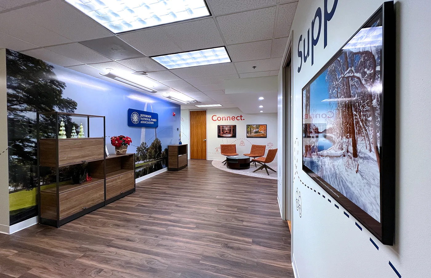
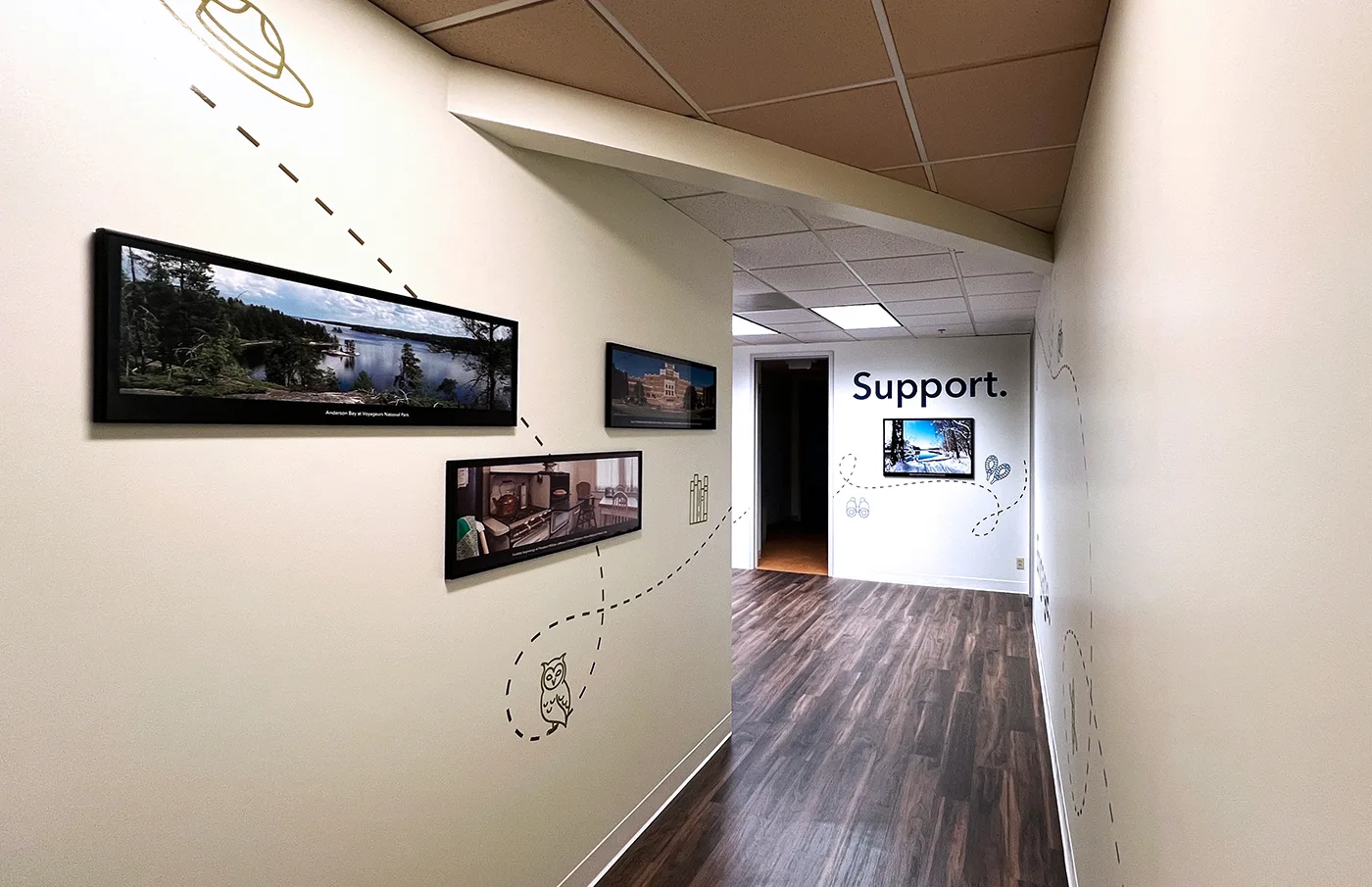
They turned to Paradigm to reimagine the space to better convey their mission to visitors and employees alike. In line with their established brand, our designers crafted multiple wall graphic designs centered around three pillars: inspire, engage and support.
Upon entering, visitors are now greeted by beauty shots of all nine JNPA parks — with room to spare as they expand into the future. Wayfinding signage throughout the space assists each guest find their way to conference rooms and other areas throughout the floor.
Inside, the environmental graphics stretch seasonal elements across each wall. Seasonal imagery hangs on the walls to showcase the evolving beauty of nature throughout the year. Travel and adventure-themed wall graphics complement the photography, hinting at the seasonal experience throughout the parks. Finally, decorative line elements connect each wall together, mirroring traditional maps.
The Chaifetz School of Business
A visit to the Entrepreneurship Office may be a business student’s first step toward charting a new path for themselves. In continuation of our partnership with the Richard A. Chaifetz School of Business at Saint Louis University, our designers reimagined the experience of walking through these halls.
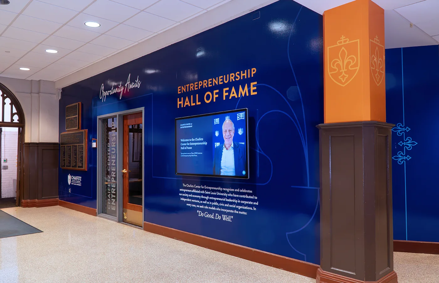
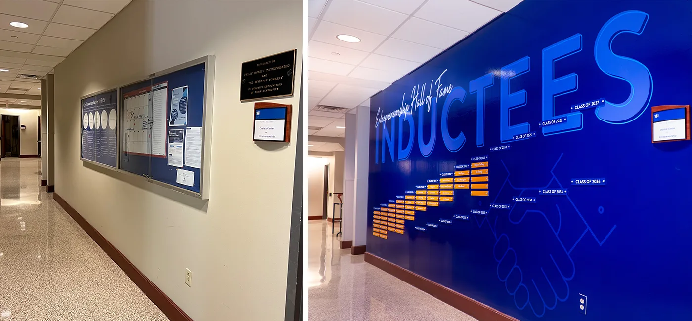
The Center for Entrepreneurship wing offered ample space to recognize Hall of Fame inductees, honor donors and state the project’s mission. Our creation displayed every inductee from the Hall of Fame’s creation in 2007, all the way to today — while still leaving room for new generations to join them for years to come.
We wove the three key elements throughout the environmental graphics, immersing each visitor in the successes stemming from the School:
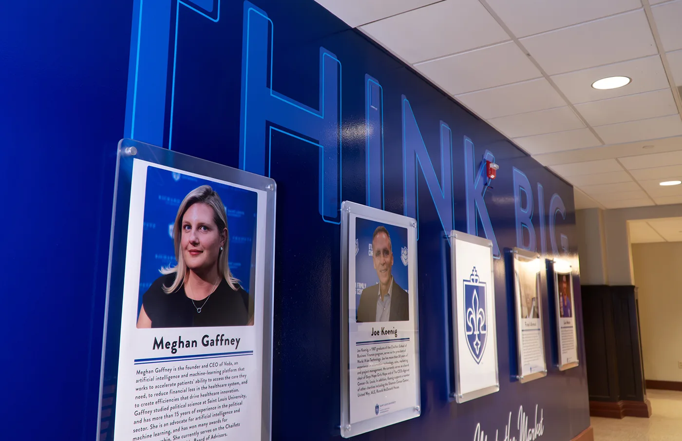
- Branded Wall Graphic Designs. Paradigm wrapped the halls with a rich whirlwind of brand colors. Blues, oranges and teals dominate each visitor’s attention and connect the area back to the larger SLU brand.
- Inspirational Brand Messaging. Messages woven across the walls emphasize the opportunities that lie ahead. Phrases such as “Think Big” and “Opportunity Awaits” encourage students and stakeholders alike to seize the day.
- Microsite. An interactive screen acts as a central feature, displaying a microsite that introduces visitors to recent Hall of Fame inductees. The full microsite provides background information for each entrepreneur, including their affiliation with SLU and professional accomplishments. For a more in-depth look, QR codes lead to supplemental videos of each honoree.
A full breakdown of the project is available on our blog.
The Gateway Arch Virtual Reality Theater
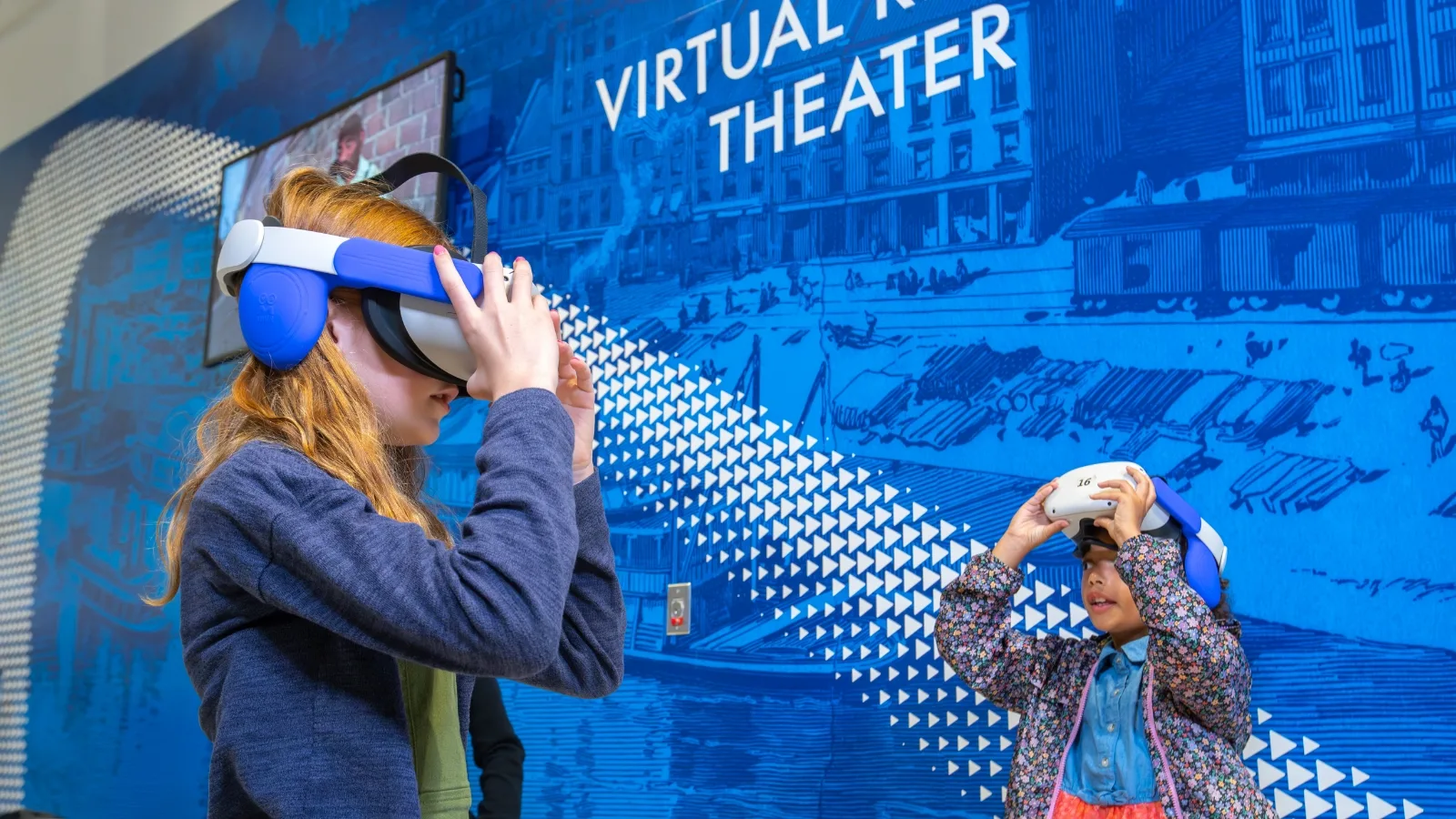
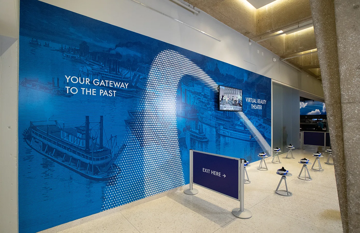
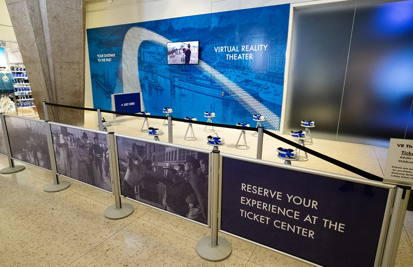
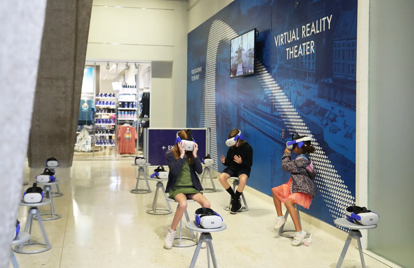
Just past the droves of people heading to the top of the Gateway Arch, a corner of the monument sat untouched. This space offered an opportunity for immersion — a 3D Virtual Reality Theater. The Gateway Arch team turned to us to reimagine the space to be more inviting to visitors of all ages and mirror the advanced technology that resides there.
Our designers mapped out the area and created a plan of action. We developed captivating graphics that blended the past, present and future together. A series of white triangles, created to mimic the keystone triangles that built the arch, created the shape of the iconic monument. The white arch contrasts with a deep blue backdrop of the iconic 1850s St. Louis riverfront — a main feature of the theater.
The resulting design created a lively, futuristic corner to host the cutting-edge virtual reality experience. A full breakdown of the resulting environmental graphics and our process is available on our blog.
Craft Your Environmental Graphics
Your consumers can experience your brand fully through immersive design experiences on your walls. From office spaces to visitor attractions, our designers showcase brands as they should be. Ready to bring your brand into the physical realm? Contact our team to start designing custom wall graphics today.
